Ann Arbor Recycle

ROLE
Designer
TEAM
Solo class project
TOOLS
Adobe Illustrator, InDesign, Photoshop
DURATION
1 month, January 2024

OVERVIEW

Brief


Recycle Ann Arbor is a nonprofit environmental organization dedicated to innovative recycling, reuse, and zero-waste solutions in the Ann Arbor community.

Recycle Ann Arbor is a nonprofit environmental service organization based in Michigan. With a mission to develop and operate innovative reuse, recycling, and zero-waste programs, the organization has served the community for decades through curbside pickup, drop-off stations, education, and advocacy. Despite their impact and reputation, their visual identity had not kept pace with the evolving design landscape or effectively reflected the progressive values at the heart of their mission.

My Contribution

This redesign was developed as an independent class project focused on branding and identity systems. I conducted visual research, ideated on concept directions, and executed the final identity and brand guide independently. The goal was to create a modern, flexible, and meaningful brand system that could represent Recycle Ann Arbor across a range of print and digital applications.

Why was the

Redesign Needed?


Recycle Ann Arbor’s previous logo and brand materials lacked cohesion and felt visually outdated. The typography and iconography did not communicate the organization’s vibrant, community-centered, and environmentally forward identity. This redesign was an opportunity to align the visual language with their core values of sustainability, innovation, and public trust.

FINAL BRAND GUIDE

Logo System

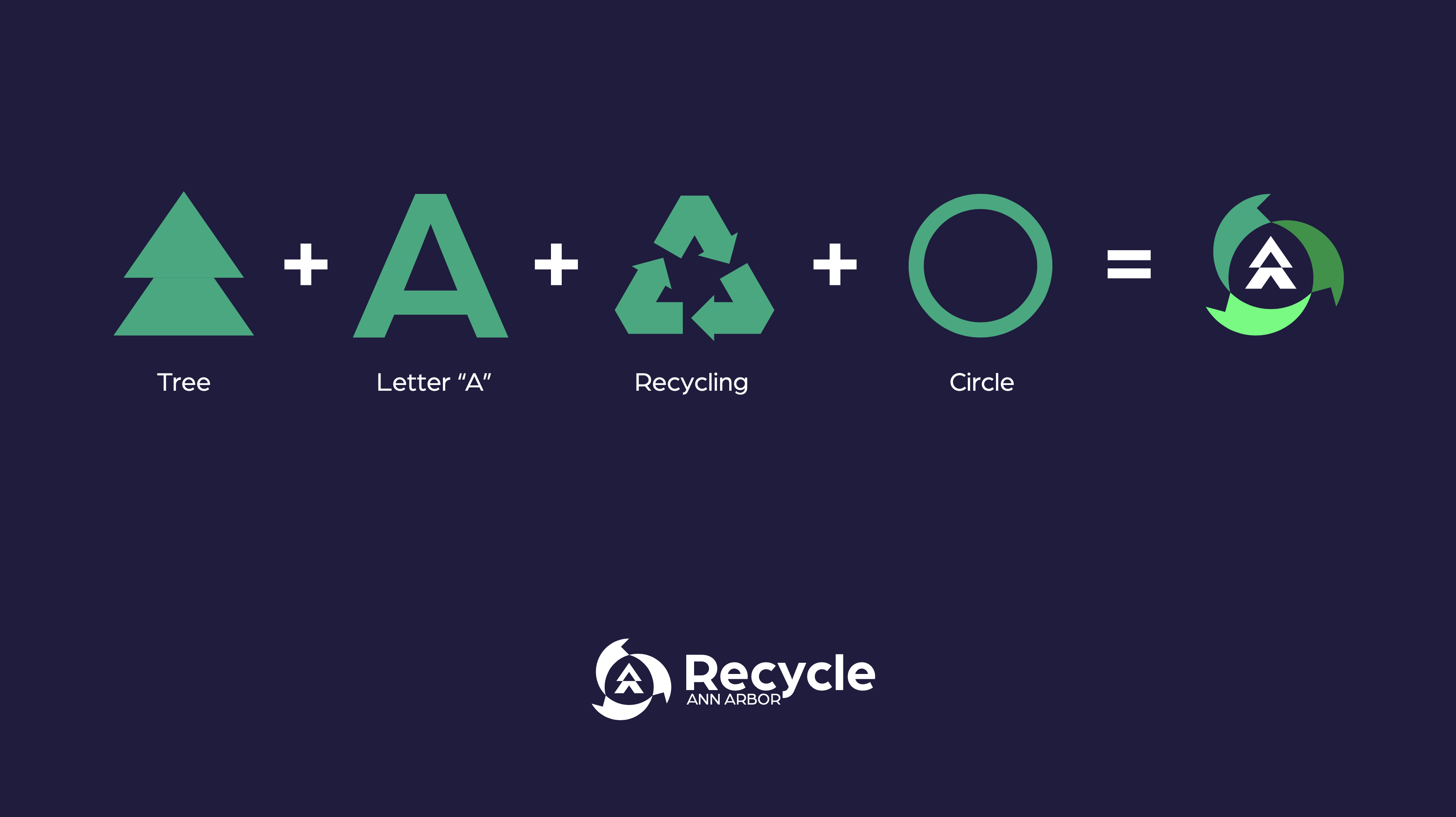
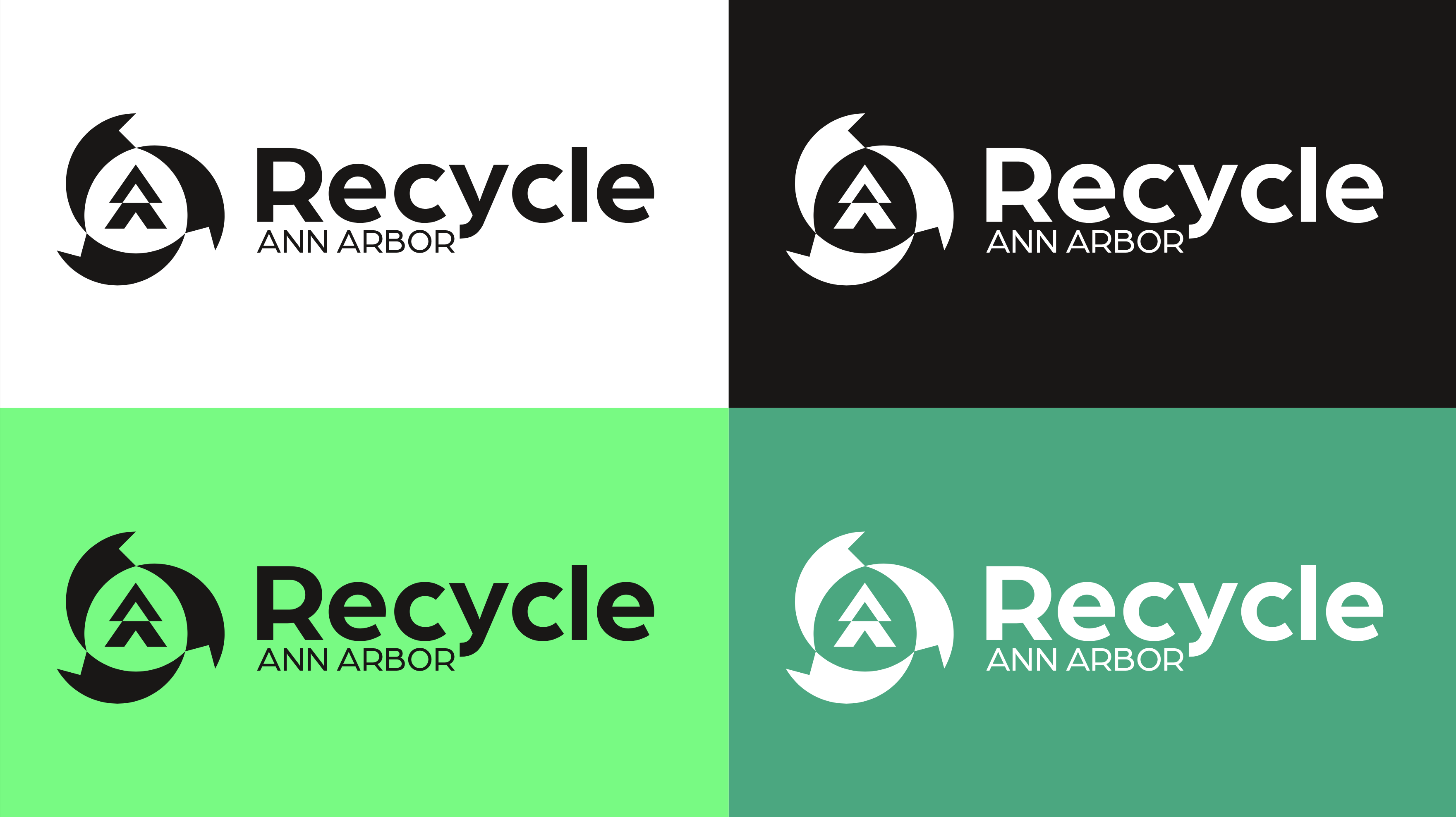
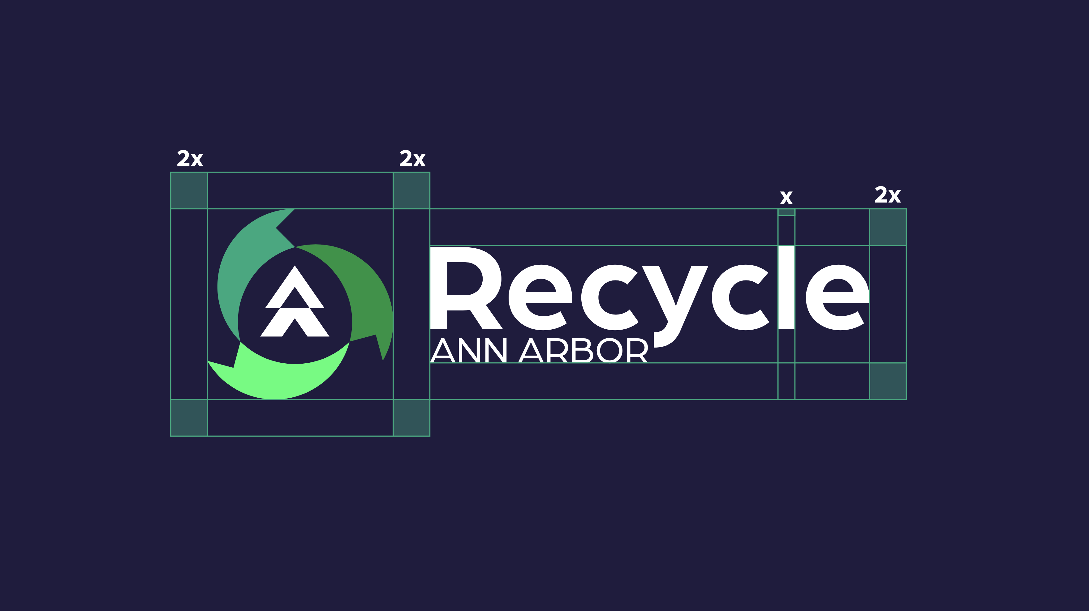
The redesigned logo for Recycle Ann Arbor is a visual synthesis of meaning and modernity. At its core, the symbol integrates a stylized letter “A” with visual cues from both a tree and the classic recycling arrows. This fusion reflects the organization’s roots in environmental advocacy while reinforcing its name and mission. The tree symbolizes growth, renewal, and nature, and idea that is central to the group’s ecological goals, while the recycling motif underscores circularity and sustainability. The final mark is geometric and bold, designed for clarity at various scales and across different media. A carefully considered wordmark accompanies the logo in both horizontal and vertical lockups, offering flexibility for diverse applications from trucks and uniforms to all digital platforms.

Style Guide

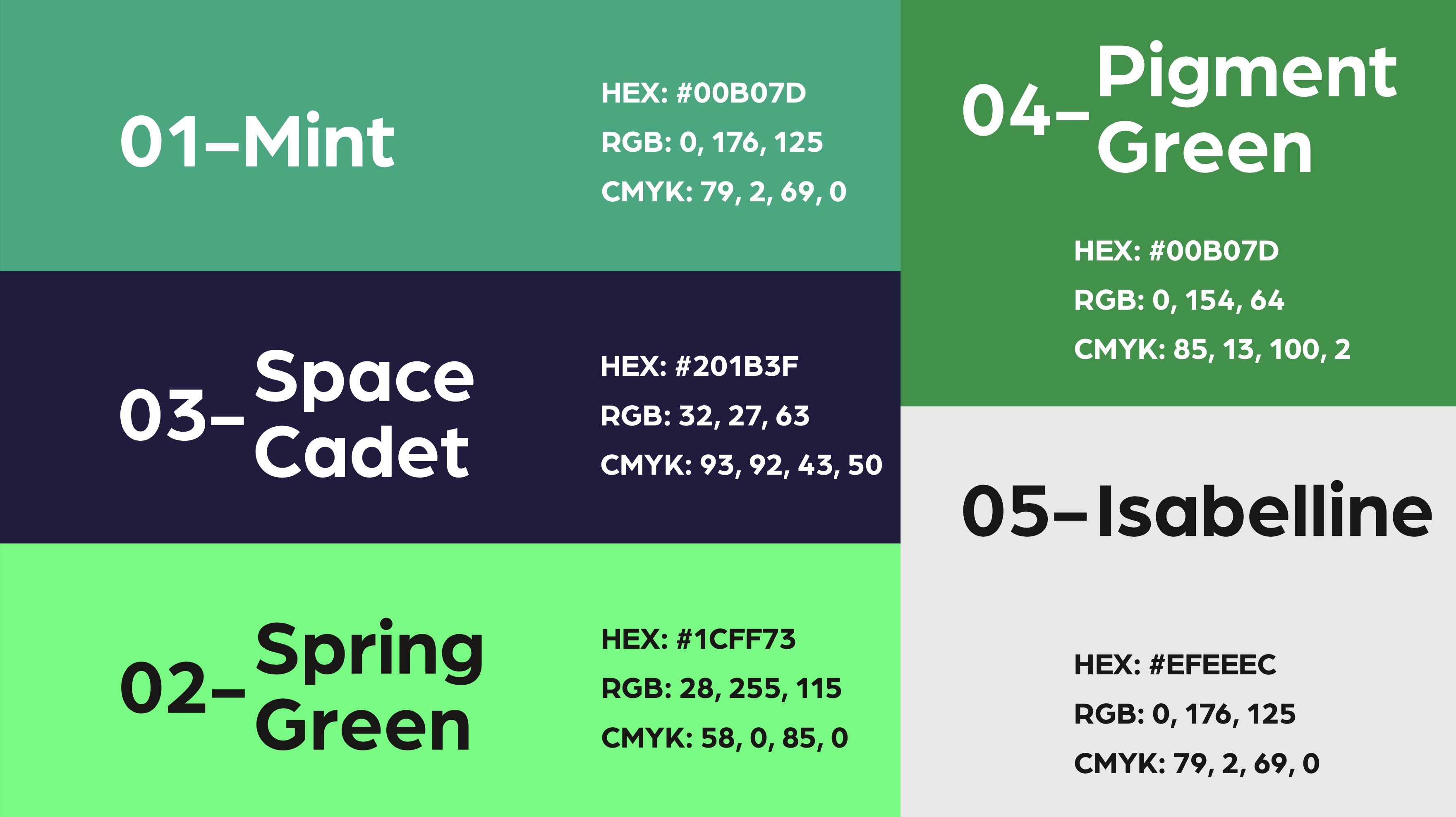
The visual language of the brand is driven by a vibrant and confident color palette. The primary green tone, Mint (#00B07D), evokes freshness and environmental energy, while Spring Green (#1CFF73) adds a burst of optimism and youth. These hues are balanced by Space Cadet (#201B3F), a deep navy that adds contrast and professionalism. For backgrounds and neutral applications, Isabelline (#EFEEEC) provides a clean, minimal backdrop, while Pigment Green (#009A40) serves as a way to bring the brand back to its roots in nature. Altogether, the palette brings energy, approachability, and environmental resonance to the brand.

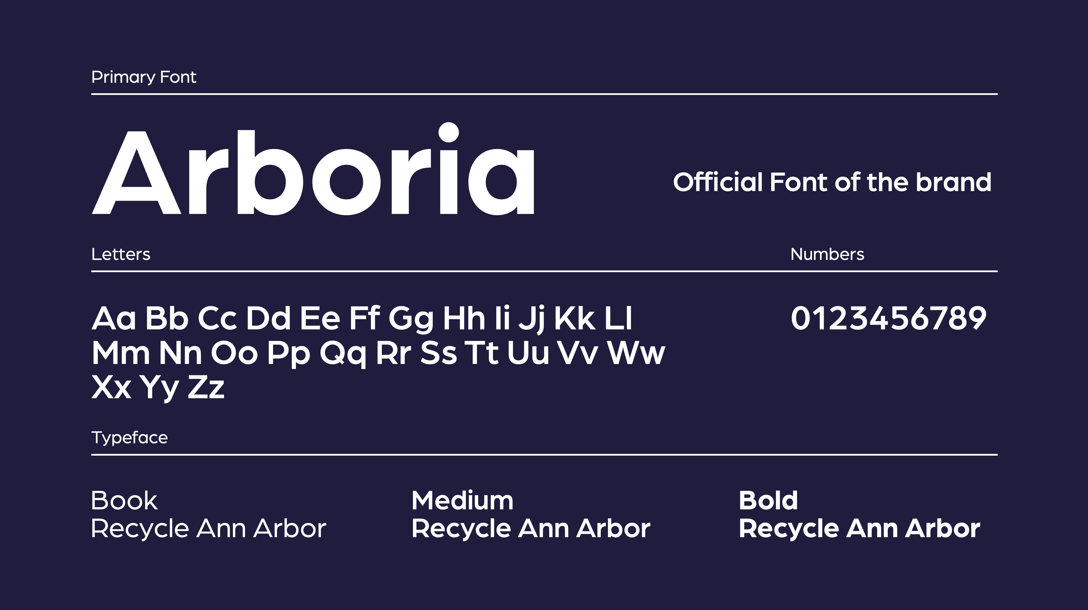
Typography is anchored by the Arboria typeface, a geometric sans-serif that embodies clarity, functionality, and warmth. With weights ranging from Book to Bold, Arboria provides versatility for both digital and print materials. It lends a modern, friendly tone while maintaining the authority and trustworthiness needed for a public-facing environmental organization. The type system supports a consistent voice across educational materials, signage, and digital platforms, reinforcing Recycle Ann Arbor’s commitment to transparency and engagement.

Applications

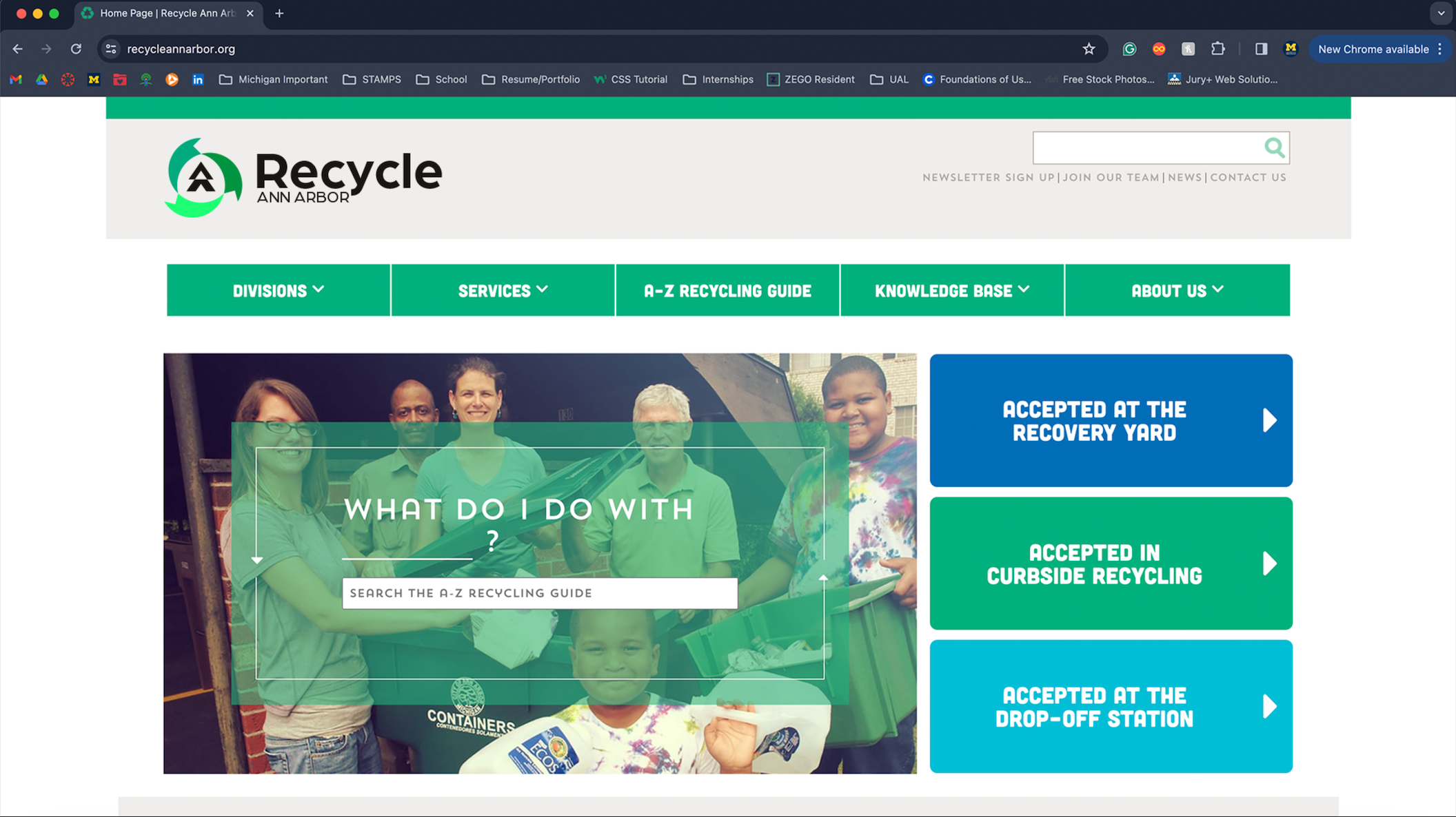
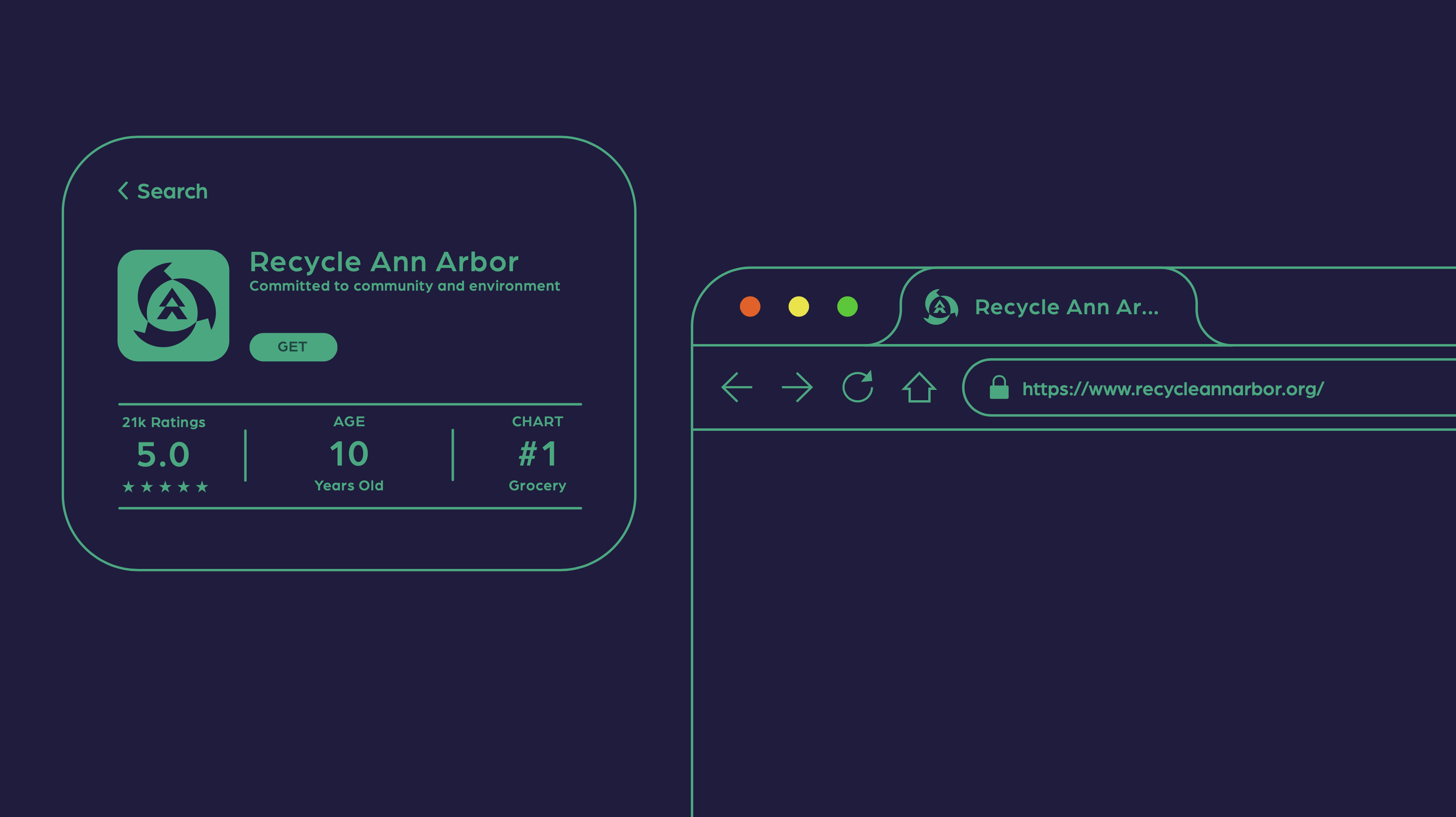
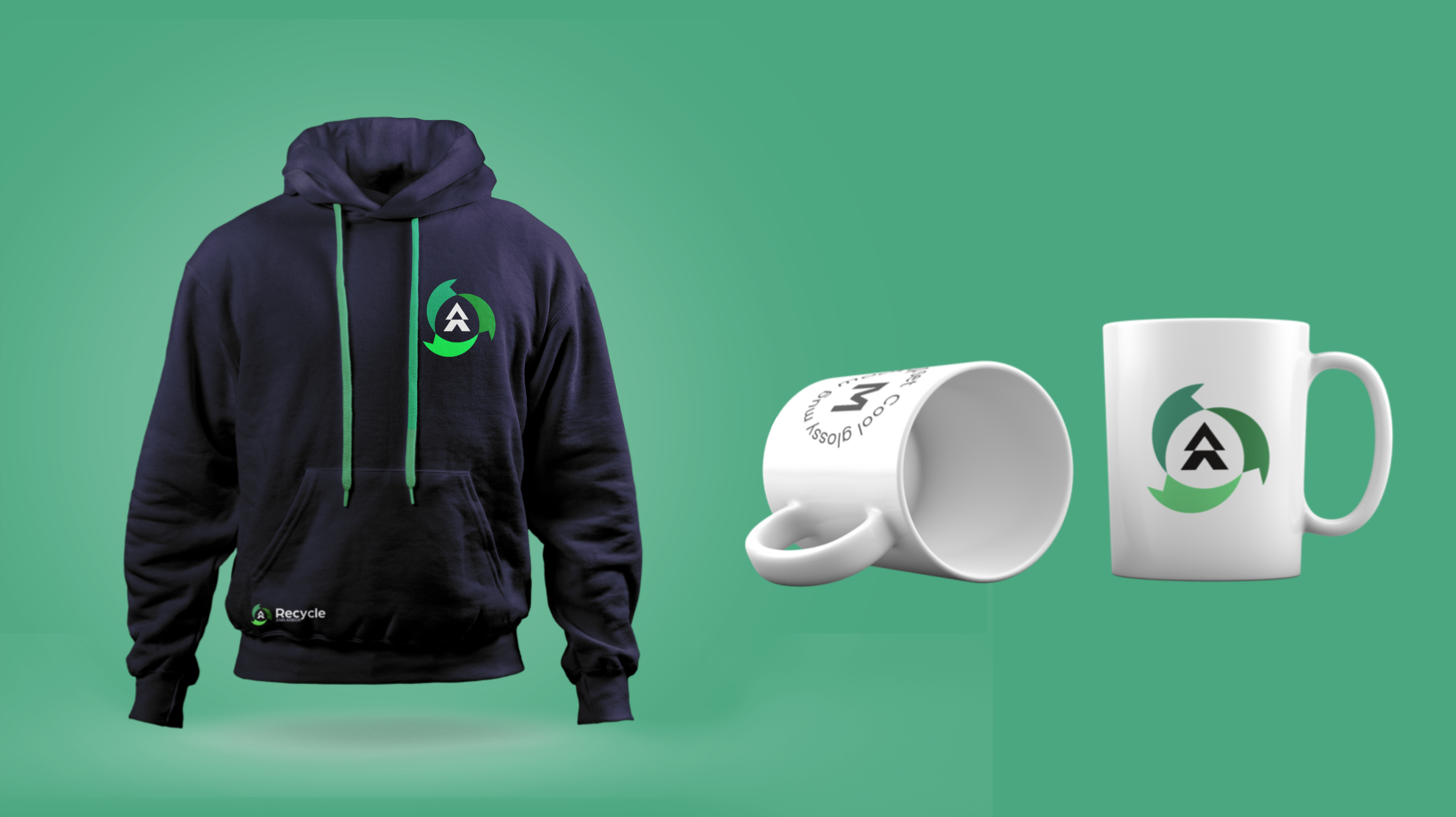
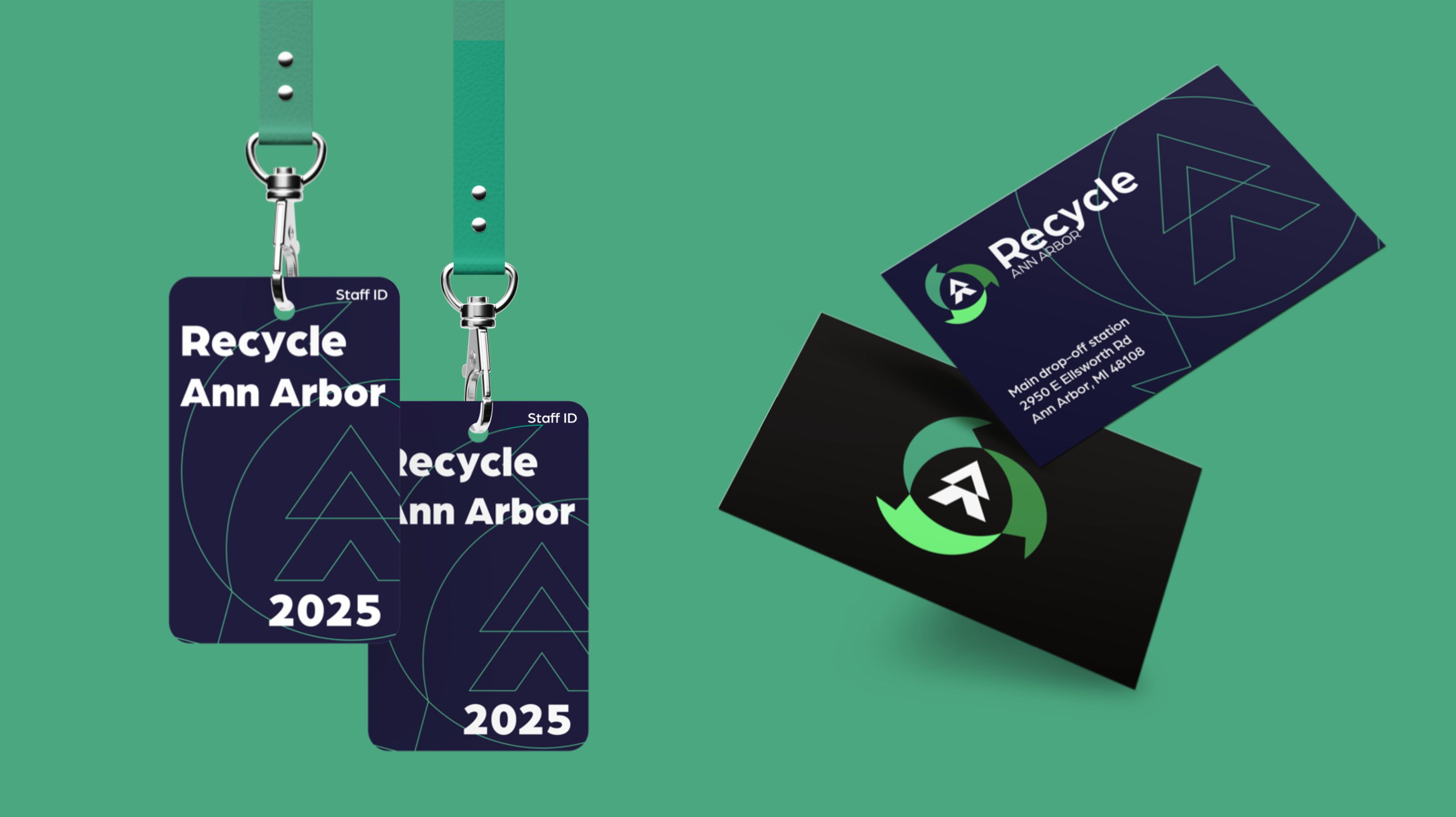
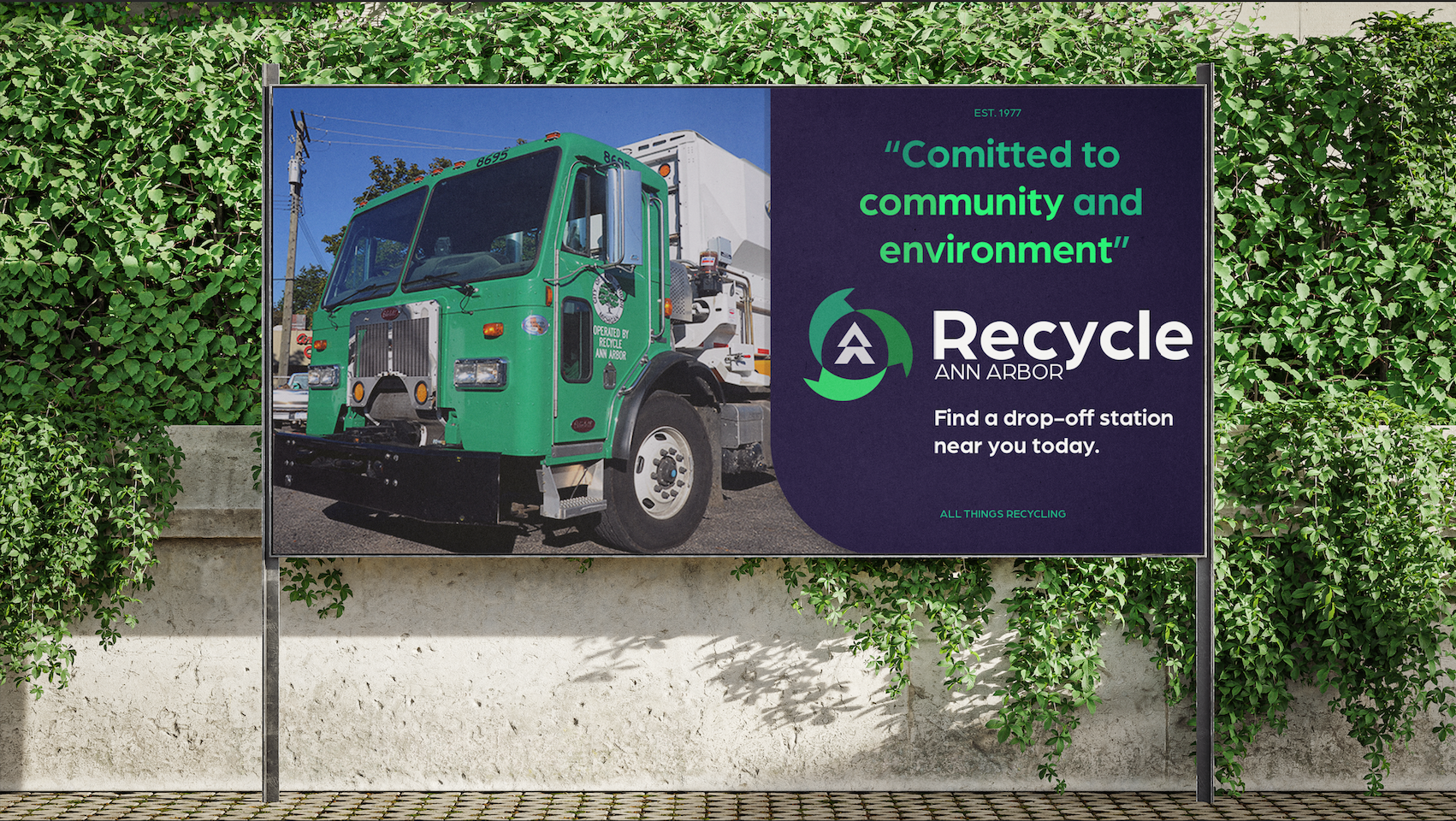
To demonstrate the adaptability and impact of the redesigned identity, the brand was applied across a series of mockups and real-world touchpoints. These include a responsive website interface, where the visual system brings clarity and consistency to navigation, as well as print materials such as flyers and event posters that extend the palette and typography into community outreach. Branded recycling bins and uniforms help solidify the organization’s presence in public spaces, creating a cohesive visual identity in physical environments. Social media templates were also developed, providing a flexible framework for sharing news, education, and calls to action. Across each application, the goal was to make the brand feel vibrant, trustworthy, and unmistakably connected to Ann Arbor’s ecological future.

Next Steps

Although this was an academic project, the brand system has real potential for community impact. The next step would be to present the redesign to Recycle Ann Arbor with a focused pitch, including mockups, rationale, and a proposed rollout strategy. Starting with digital assets like social media or the website would allow for low-barrier implementation. Collaboration with their communications team could help tailor the identity further, and community feedback through surveys or focus groups could ensure the new design resonates with their audience.

Takeaways

This project highlighted the importance of research-driven design. Understanding Recycle Ann Arbor’s mission and voice had a large part in shaping the visual identity to be not only aesthetically pleasing but also aligned with their values. It also underscored how critical flexibility is as a strong brand must adapt across mediums and evolve with the organization. Lastly, it reinforced how thoughtful design can elevate nonprofit work by making impact, trust, and community engagement more visible and memorable.

Back to Top