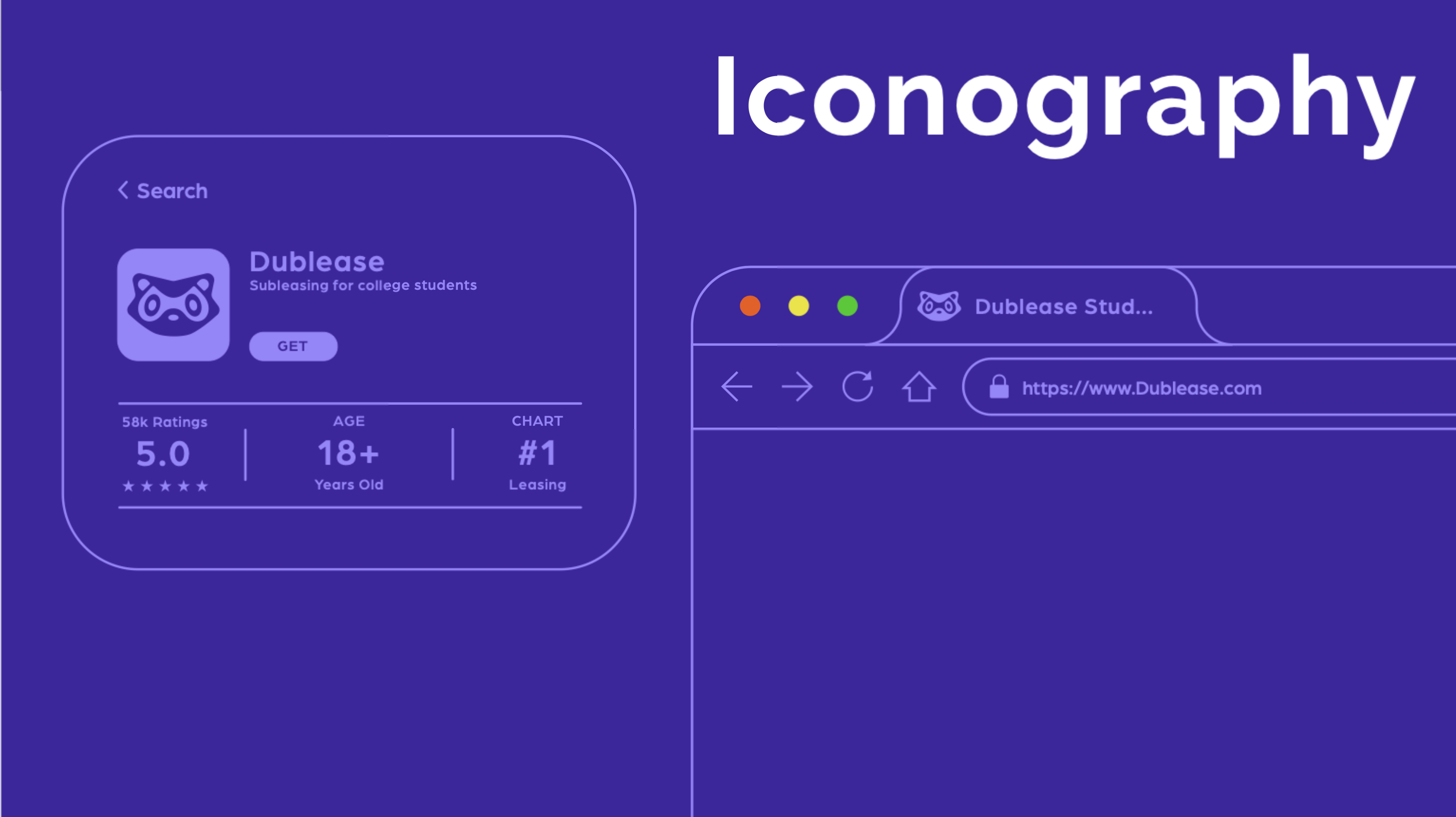
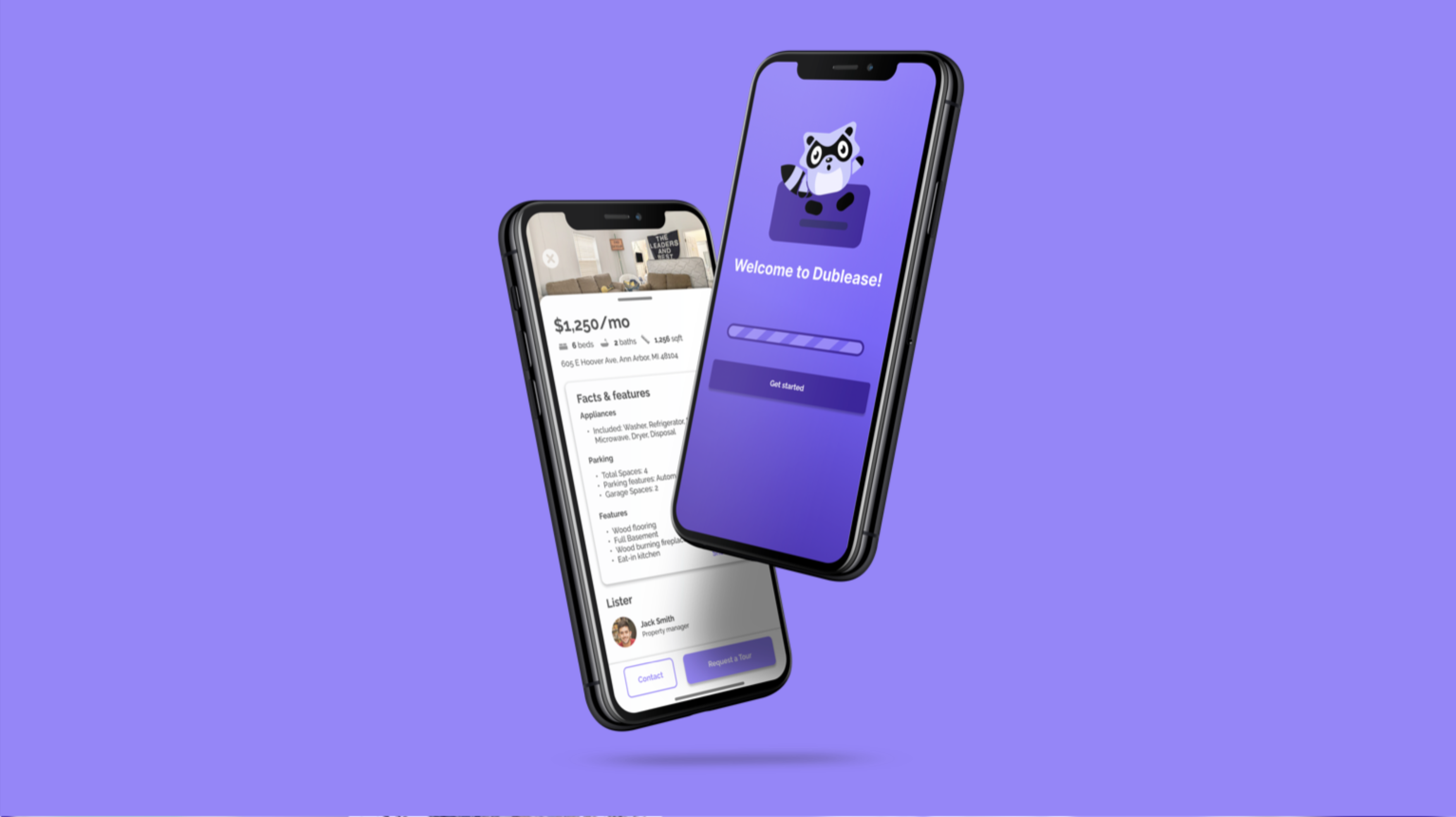
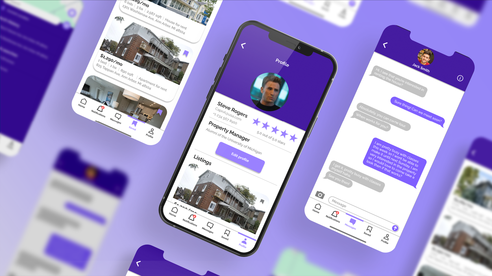
OVERVIEW
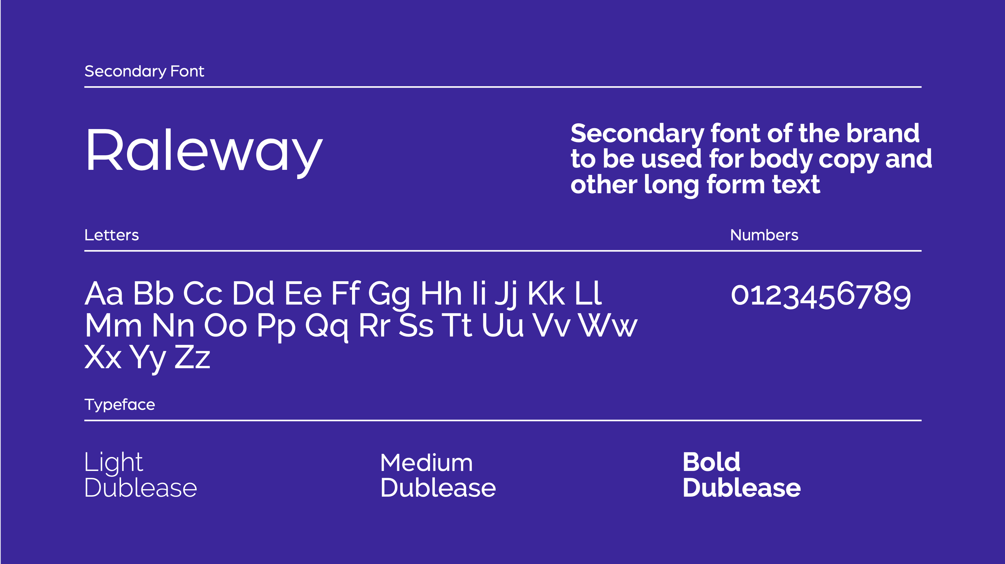
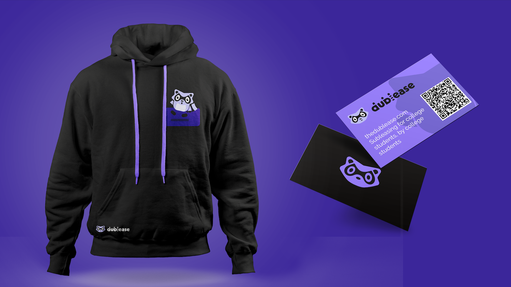
Dublease is a digital subleasing platform designed for college students who need short-term housing solutions. The app simplifies the process of posting and finding sublets near campus, whether between semesters, study abroad periods, or unexpected moves. The brand was created to reflect that sense of practicality with a touch of charm.
This was a solo project completed for a UI/UX design course, but it was also created in collaboration with a friend who initially came up with the idea for Dublease. They offered input throughout the branding process, especially in the development of the mascot and logo.
FINAL BRAND GUIDE
The Dublease logo is a customized wordmark built from Neue Kabel Bold, chosen for its structured but approachable look. The mascot which is a raccoon, was inspired by a joke among the original team: that college students often live like raccoons, taking what they can get, making the best of small spaces, and surviving off scraps. It humorously captures the reality of student housing, functional, maybe a little rough around the edges, but reliable. Designed to be more than a static visual, the raccoon mascot acts as an in-app companion, offering reminders, encouragement, and short tutorials to support users throughout their journey. This interactive element adds personality and approachability to the product, while reinforcing user engagement over time. Supporting iconography follows the same philosophy: clean, minimal, and rounded for clarity and friendliness, working well in both light and dark modes.
The Dublease color palette is designed to feel both calm and youthful. Its primary color, Sky Blue (#5CB5FF), conveys clarity and optimism, while Persian Indigo (#29005F) adds depth and trust. Amethyst (#A973FF) serves as an accent that energizes the layout without overwhelming it, and a clean combination of Eerie Black (#211F1D) and White (#FFFFFF) ensures strong contrast and readability.
Typography is led by Neue Kabel Bold in the logo and header treatments, customized to give the brand a slightly quirky yet modern character. For body text and long-form content, Raleway was chosen as the secondary typeface due to its elegant structure and high legibility. The font pairing was selected to bridge visual personality with clarity, particularly across responsive designs.
The Dublease brand was applied across both digital and physical platforms to showcase its flexibility. In the digital prototype, the raccoon mascot appears throughout key moments like onboarding and listing confirmations, while the color palette and typography bring coherence to search pages, listing previews, and user dashboards. Physical mockups include branded business cards, a hoodie, and a promotional poster are all designed using the established visual system. These mockups demonstrate how the brand identity scales from screen to real-world touchpoints, helping build recognition and community presence on college campuses.
The next phase of development would include expanding the mascot’s role with animations and reactive expressions tied to user behavior, making it a more dynamic presence within the app. Marketing assets would also be extended into campus flyer templates, social media kits, and onboarding email designs, all of which built within the existing visual system. Accessibility improvements, such as refined contrast ratios and motion sensitivity settings, are also important next steps to ensure accessibility for all.
Designing the Dublease brand taught me how meaningful collaboration can truly elevate design decisions, especially when working on a product that’s deeply personal to its users. The raccoon mascot started as a joke but became the heart of the brand, grounding the identity in humor and relatability. This project also reinforced the importance of consistency across digital and physical media, and how branding can serve not just as decoration, but as a strategy for connection, trust, and long-term engagement.