Meal PlanR

See Prototype
ROLE
UI/UX Designer
TEAM
Solo Project
TOOLS
Figma, Adobe Illustrator
DURATION
2 week

OVERVIEW

Making critical feeding intervention training accessible to families everywhere.

particularly food selectivity in children with autism. Developed through 15 years of research, the intervention effectively reduces mealtime stress and expands dietary variety. However, it required parents to attend multiple in-person training sessions at specialized clinics, causing a significant barrier for families already navigating complex healthcare needs.When MealPlanR approached Inovar Health, LLC about creating a digital learning platform, they needed to see what was possible.

My Contribution

I designed the complete proof-of-concept for MealPlanR's e-learning platform within a two-week timeline. I developed the visual identity expansion, information architecture, user interface design, and interactive features across all platform screens.

THE CHALLENGE

Extending a brand with care.

Limited digital presence: MealPlanR had a basic website and logo, but no cohesive digital ecosystem or established patterns for online learning delivery.

Complex content: The curriculum involved detailed behavioral intervention strategies, nutritional guidance, and parent training protocols across 12 structured sessions spanning three treatment phases.

Dual audience: The platform needed to serve both professional therapists delivering the training and parents learning to implement strategies with their children.

Need for engagement: Clinical training materials risk feeling dry or overwhelming. The platform needed to maintain engagement without sacrificing the rigor and credibility of the evidence-based approach.

Fast turnaround: This proof-of-concept required polished, comprehensive designs that demonstrated the full scope of what the final platform could become.

THE CONCEPT

Designing the full journey in eight screens.

This section walks through each of the eight core screens designed for the proof-of-concept. Each screen highlights specific visual and functional decisions that support the learning journey while maintaining brand consistency and user engagement.

Dashboard

The dashboard serves as mission control, answering "What should I do today?" with Continue Learning courses at the top, a Progress widget showing daily goals and achievement badges in the right column, and Recommended Courses below. Color-coded phase badges (green, pink, orange) correspond to the three treatment stages, helping users quickly identify where each course fits in their journey.

Courses

The courses section provides filtering by status (All, In Progress, Completed, Saved) and organization by treatment phase. Each card displays a hero image, color-coded phase label, estimated time, progress bar, and brief description, allowing users to quickly scan available content and understand their advancement through the program.

Lesson Interface

A two-column layout places the course outline with checkmarks (completed) and empty circles (upcoming) on the left, while the main video player and lesson title occupy the right. Format indicators (Video, Reading) and time estimates help users plan sessions around available time, minimizing distractions during learning.

Lesson Info Page

Below the video player, tabs provide About information with course description and "Get Started!" button, an Estimated Schedule calendar widget for self-paced or cohort learning, and a Reviews section with 4.9-star average and rating distribution. This social proof helps users gauge course quality before starting.

AI Bot Chat Overlay

The MealPlanR AI bot, accessible from a persistent floating button, features a friendly character design that echoes the brand's apple logo through the leaf and stem antenna detail. The full-screen chat interface includes response actions (copy, thumbs up/down, refresh) and addresses parents' need for immediate guidance during implementation moments when professional support isn't available.

Certificates

Earned credentials display with professional formatting in two styles: modern sans-serif with blue diagonal accent, and elegant script with ornate borders. Each card shows the course name and issuing organization (Children's Specialized Hospital), providing therapists with documentation for continuing education requirements.

Profile

The profile consolidates Personal Details, major milestone Badges (gold #1, red target), an 8-icon grid of food-themed Achievements representing completed modules, Weekly Streak tracking with flame icon, and Progress charts including a circular completion percentage and weekly watch time bar graph. This gamification maintains engagement while celebrating meaningful advancement through the program.

Settings

Five categories in the left sidebar (Account Information, Notifications, Content, Calendar Sync, Privacy & Security) provide streamlined account management. The Account Information panel includes form fields for name, email, timezone, language, and password management, putting users in control without overwhelming them with options.

THE PROCESS

Working within what already existed.

I began by sketching layout ideas and exploring different approaches for key features like the AI chatbot character, testing various personality options to balance approachability with brand alignment.

Low-fidelity wireframes allowed me to explore screen layouts and information hierarchy across all eight core screens, testing different arrangements for the dashboard's progress tracking, course card structures, and navigation patterns to ensure the flow felt intuitive before adding visual polish.

Style Guide

I developed a comprehensive style guide to ensure visual consistency across the platform. Building on MealPlanR's existing blue-purple palette and apple logo, I expanded the system with functional accent colors for phase identification (green, pink, orange) and neutral grays for hierarchy. Key components included course cards with consistent layouts, clear navigation iconography, multiple progress indicators, food-themed achievement badges, and the AI bot character featuring brand callbacks through the leaf/stem antenna detail. The goal was warmth without sacrificing professionalism, working equally well for pediatric therapists and parents.

DESIGN DECISIONS

The details that made it work.


At the start of the project, I reviewed the original screens to identify key visual and usability issues. This section outlines my initial concerns along with suggested updates to improve clarity, cohesion, and overall user experience.

Visual Warmth Over Clinical Sterility:

Warm colors, friendly illustrations, and food-themed achievements create an encouraging environment rather than an overwhelming institutional one.

Always-Accessible Support:

The floating AI bot provides persistent access to help, reflecting that learning doesn't happen linearly and support needs don't wait for office hours.

Progress Everywhere:

Constant progress indication (percentage bars, checkmarks, circles, badges) is especially important in a program where real-world results might take weeks to materialize.

Brand Consistency With Functional Clarity:

Colors serve functional purposes: phase labels for quick identification, consistent blue for action buttons, recognizable food colors for badges. Visual elements help users navigate, not just decorate.

Gamification Without Trivialization:

Achievement systems (badges, streaks, certificates) maintain engagement without diminishing the serious nature of behavioral intervention work, tying back to program goals and celebrating meaningful progress.

THE FINAL PRODUCT

A proof of concept that proved the point.

Within two weeks, I delivered comprehensive high-fidelity concept screens demonstrating a cohesive visual identity expansion, clear information architecture, innovative support features, thoughtful gamification, and a warm interface balancing professional credibility with emotional support. The designs gave the MealPlanR team and my supervisor tangible proof that their evidence-based intervention could translate successfully into a scalable digital platform.

Next Steps

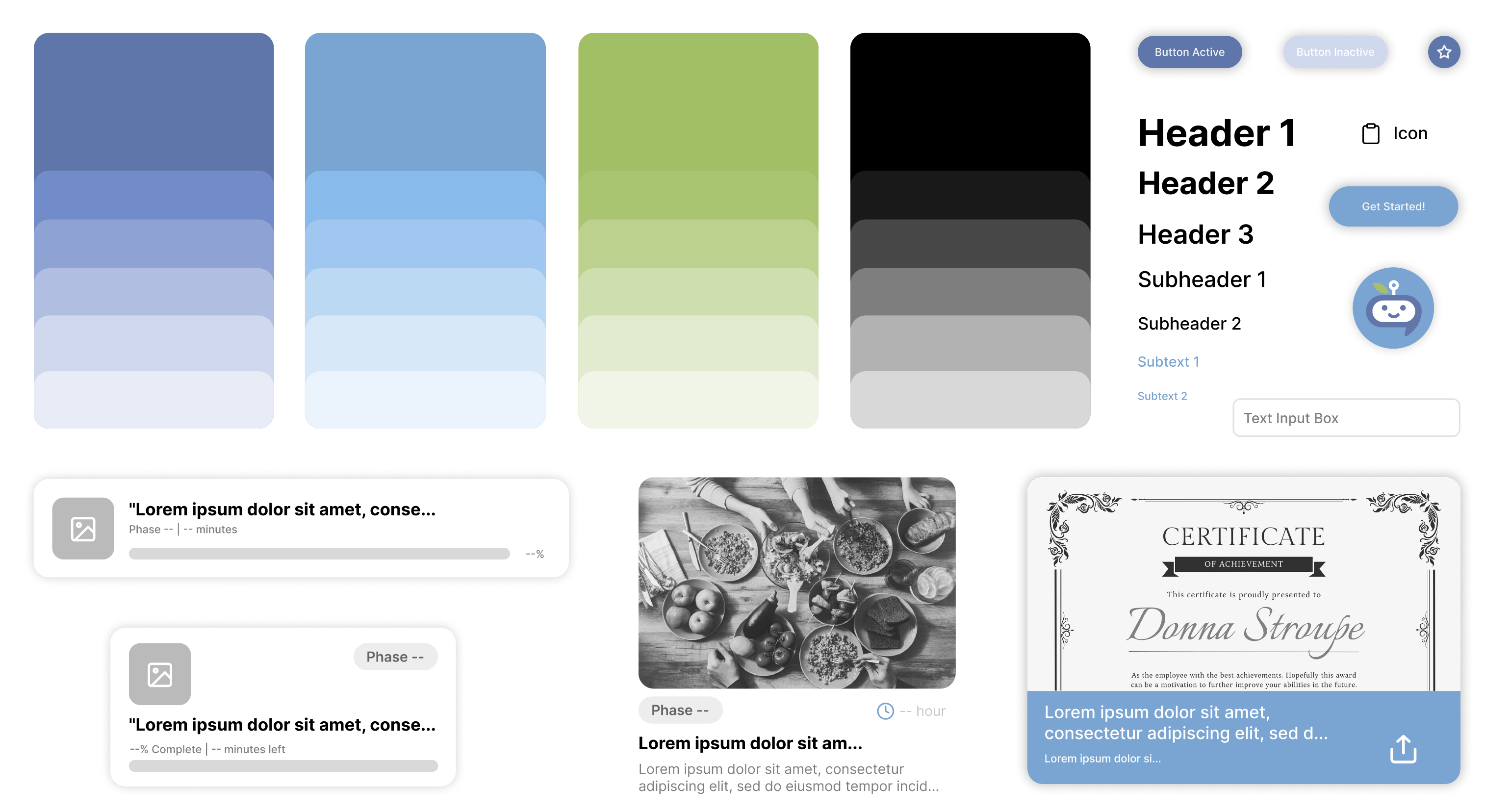
The immediate goal of demonstrating feasibility has been achieved. Moving forward, user testing with real therapists and parents would validate design decisions and uncover usability issues. Future development would include detailed interaction states (error messages, loading screens, empty states), community features for peer support, analytics for therapists tracking client progress through the curriculum, and ultimately building the functional platform from these concept screens.

Takeaways

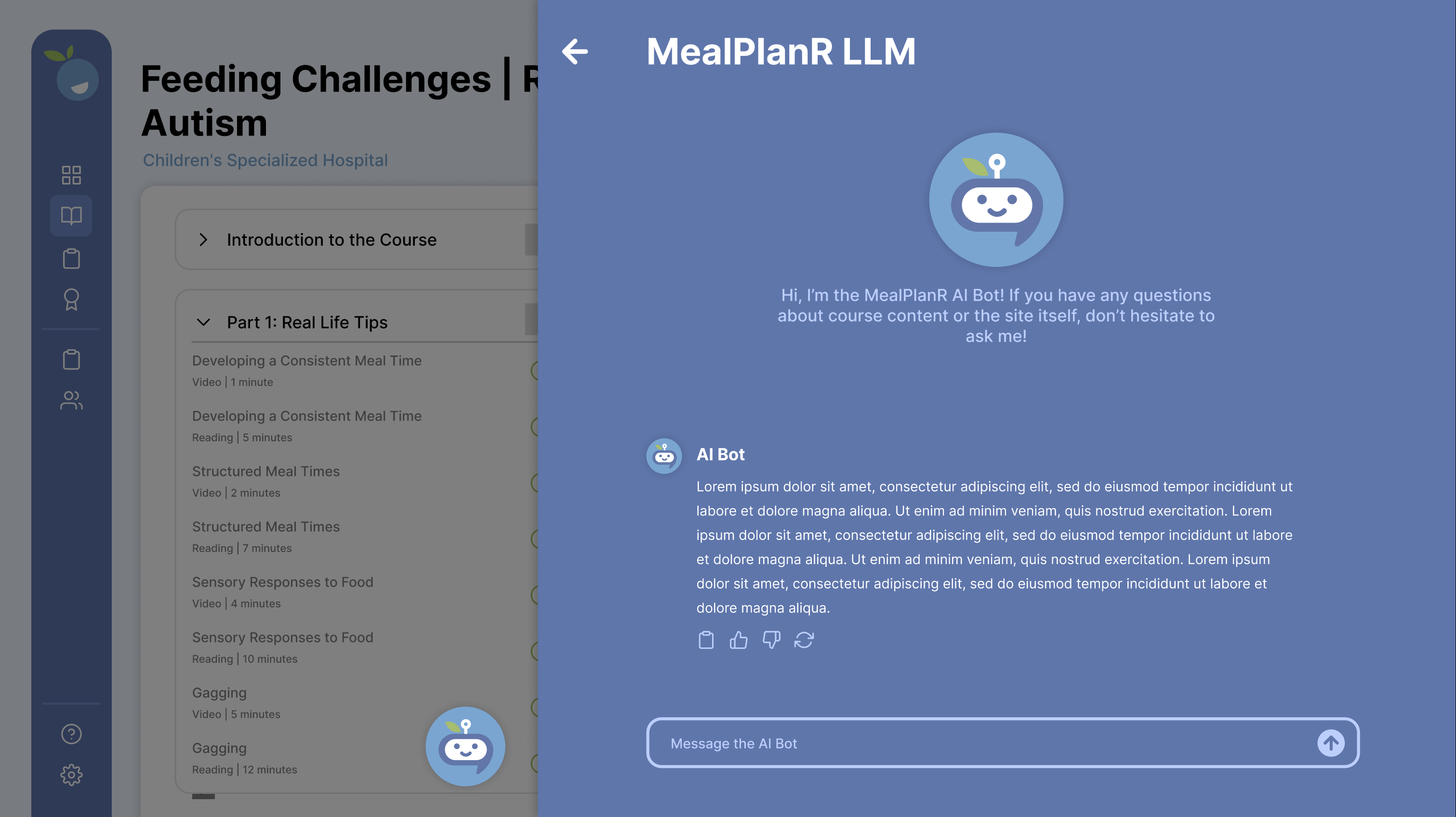
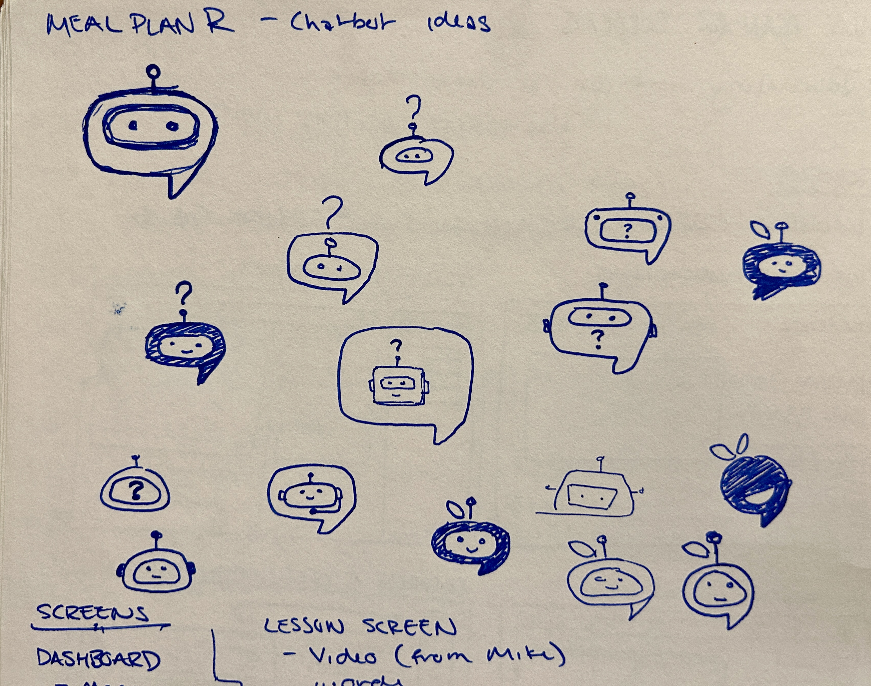
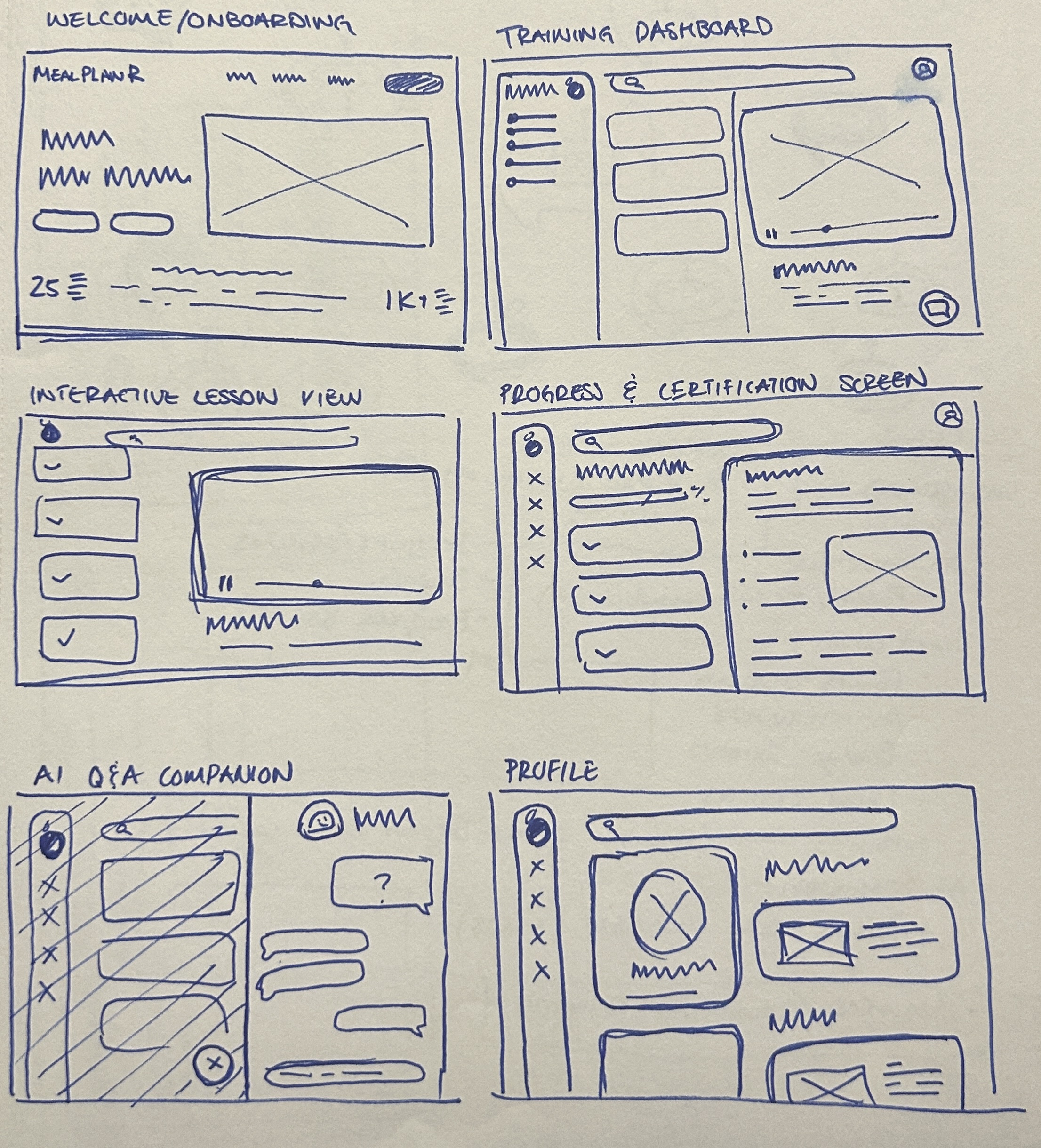
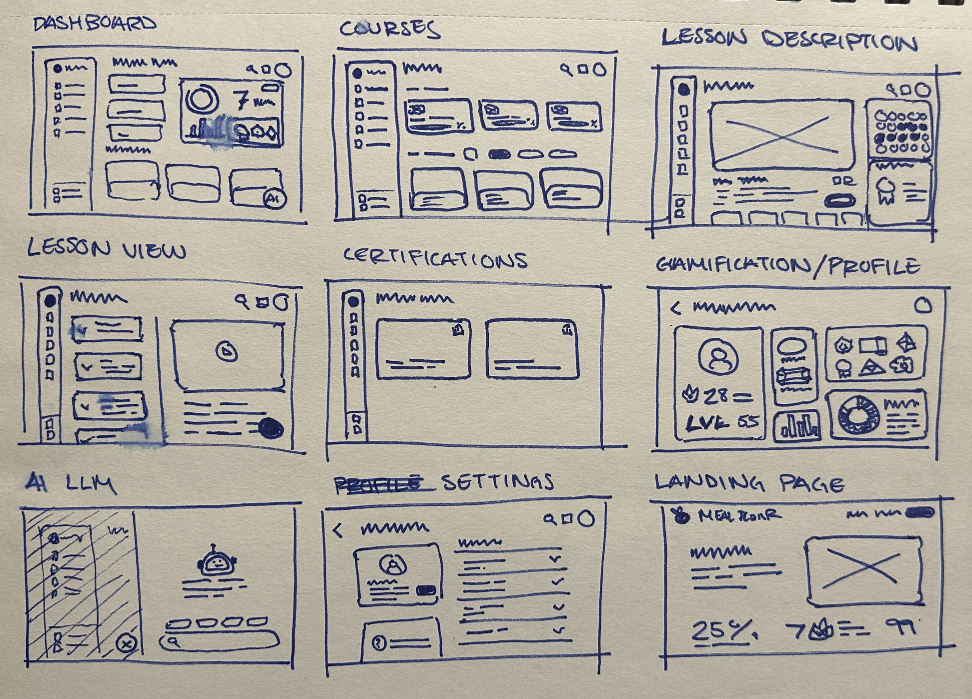
Taking time to truly understand the three-phase treatment approach, therapist-caregiver dynamic, and behavioral intervention strategies allowed me to design interfaces supporting the actual learning journey rather than just displaying content. Rather than forcing a complete rebrand, I built carefully on what already existed, expanding MealPlanR's identity into digital spaces with respect and intention. Features like the AI bot weren't included because they were trendy, but because they solved real problems users would face when implementing training content in their daily lives.

Back to Top