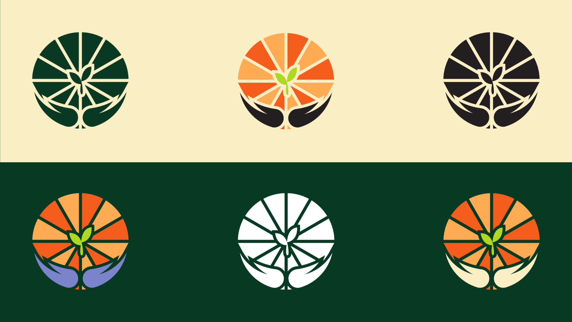
Nurturing Our
Seeds

ROLE
Brand & UX Designer
TEAM
Team Class Project
TOOLS
Figma, Adobe Illustrator, Photoshop
DURATION
1 month, November 2024

OVERVIEW

A brand that grows with its community.

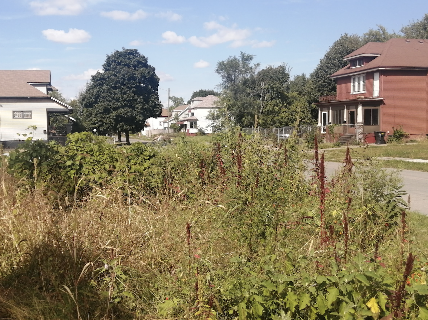
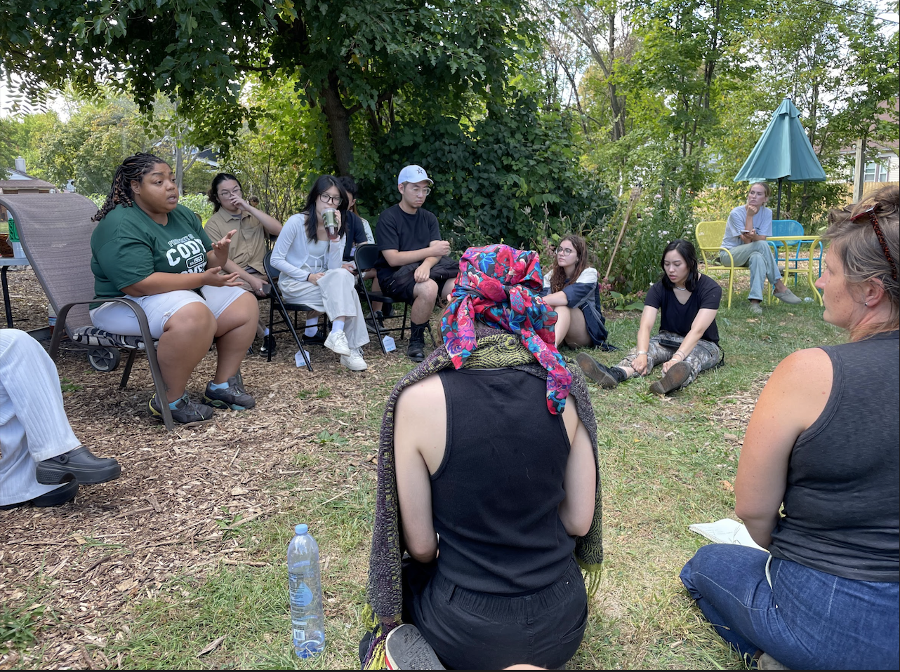
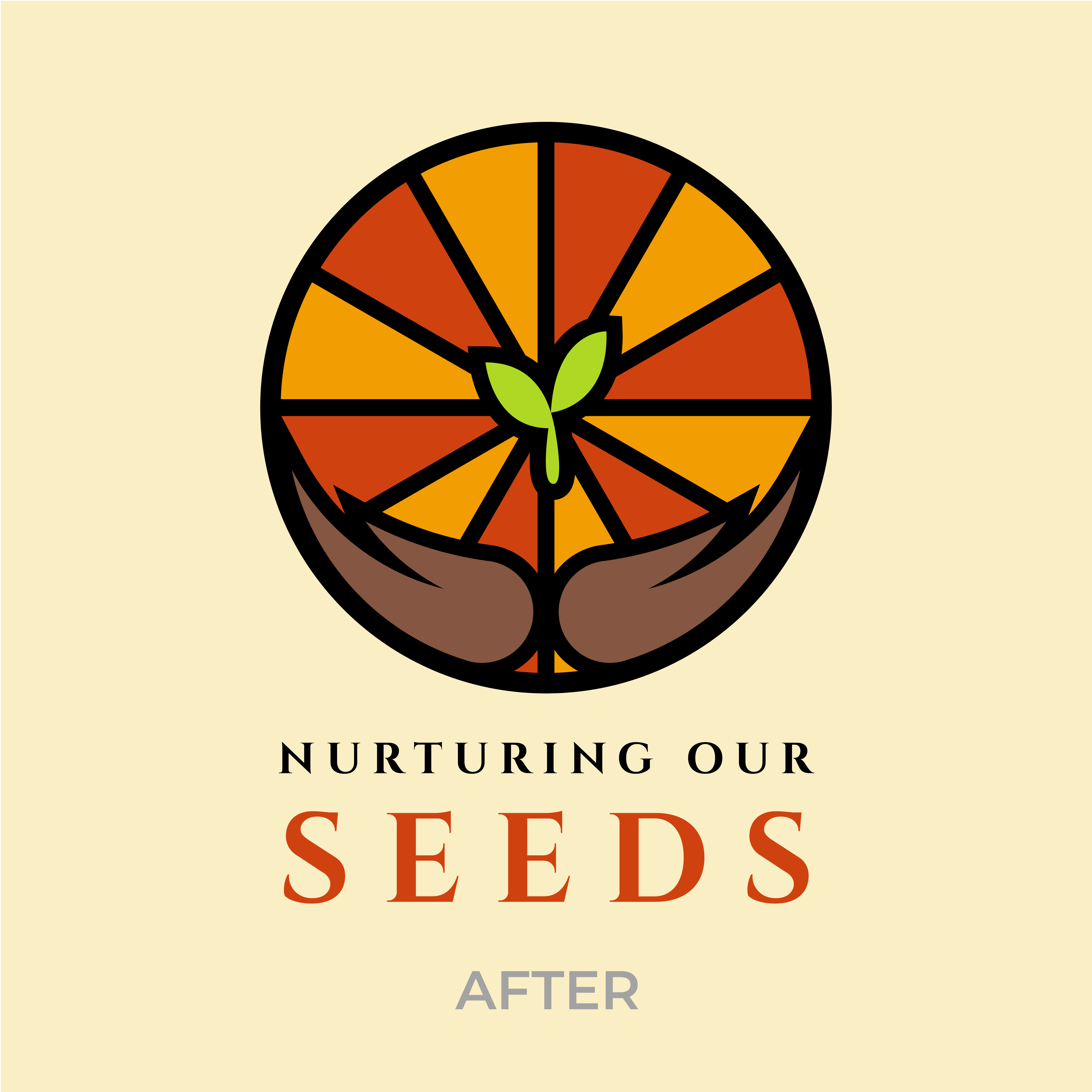
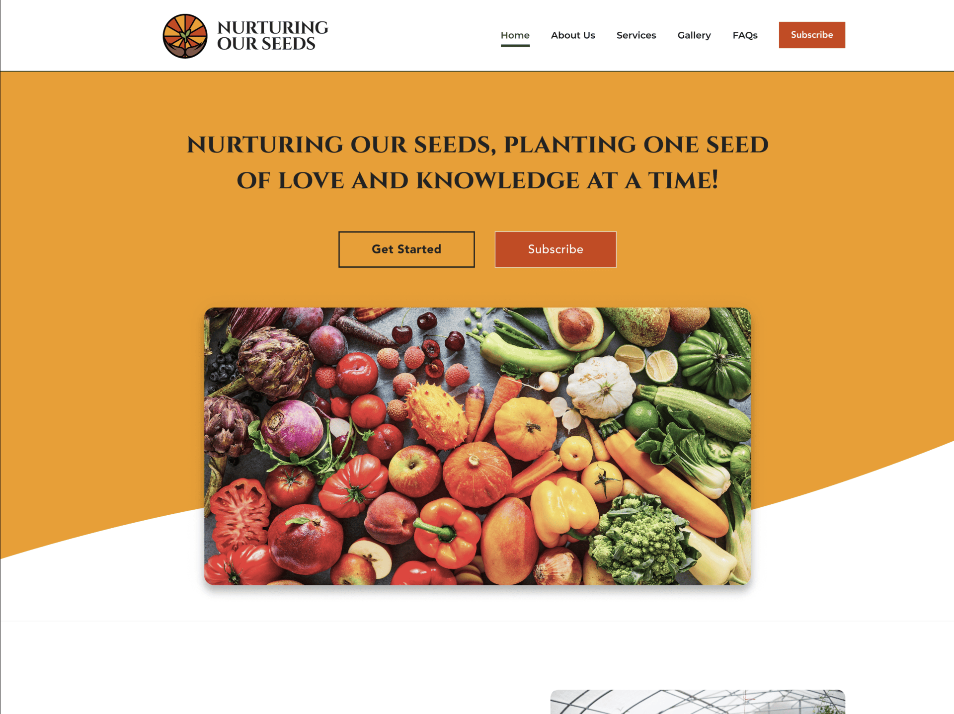
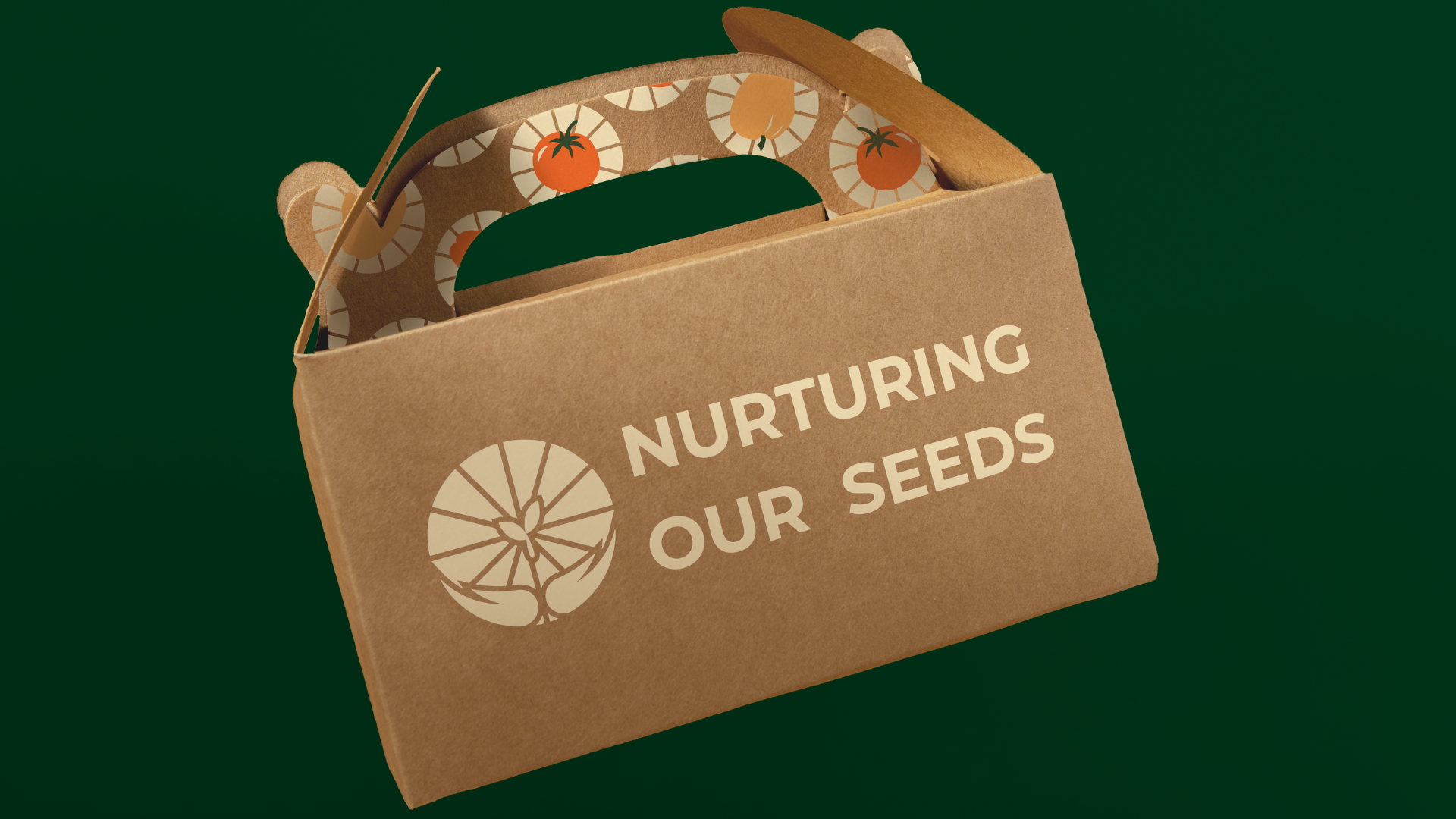
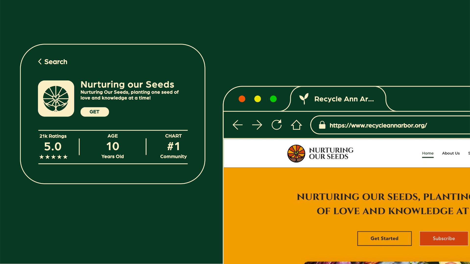
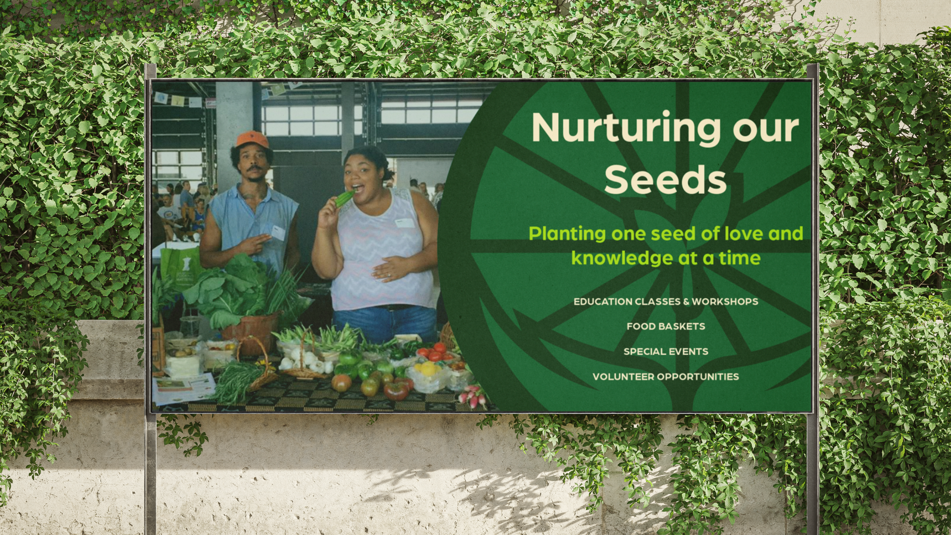
Nurturing Our Seeds is a Detroit-based non-profit urban farm working to make healthy, locally grown food accessible while promoting sustainable practices and community education. They run workshops, distribute food baskets, and bring people together through hands-on farming experiences.

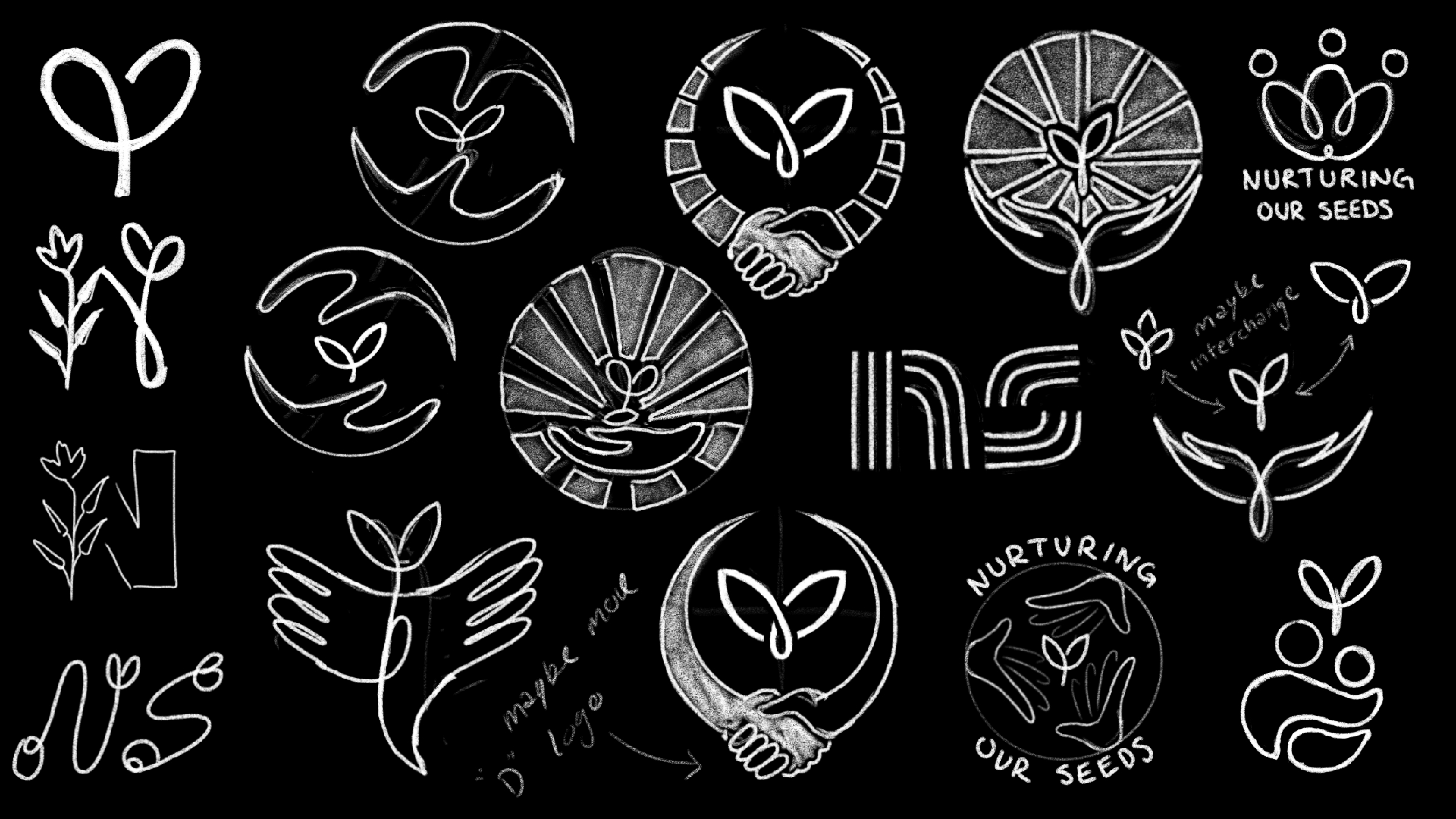
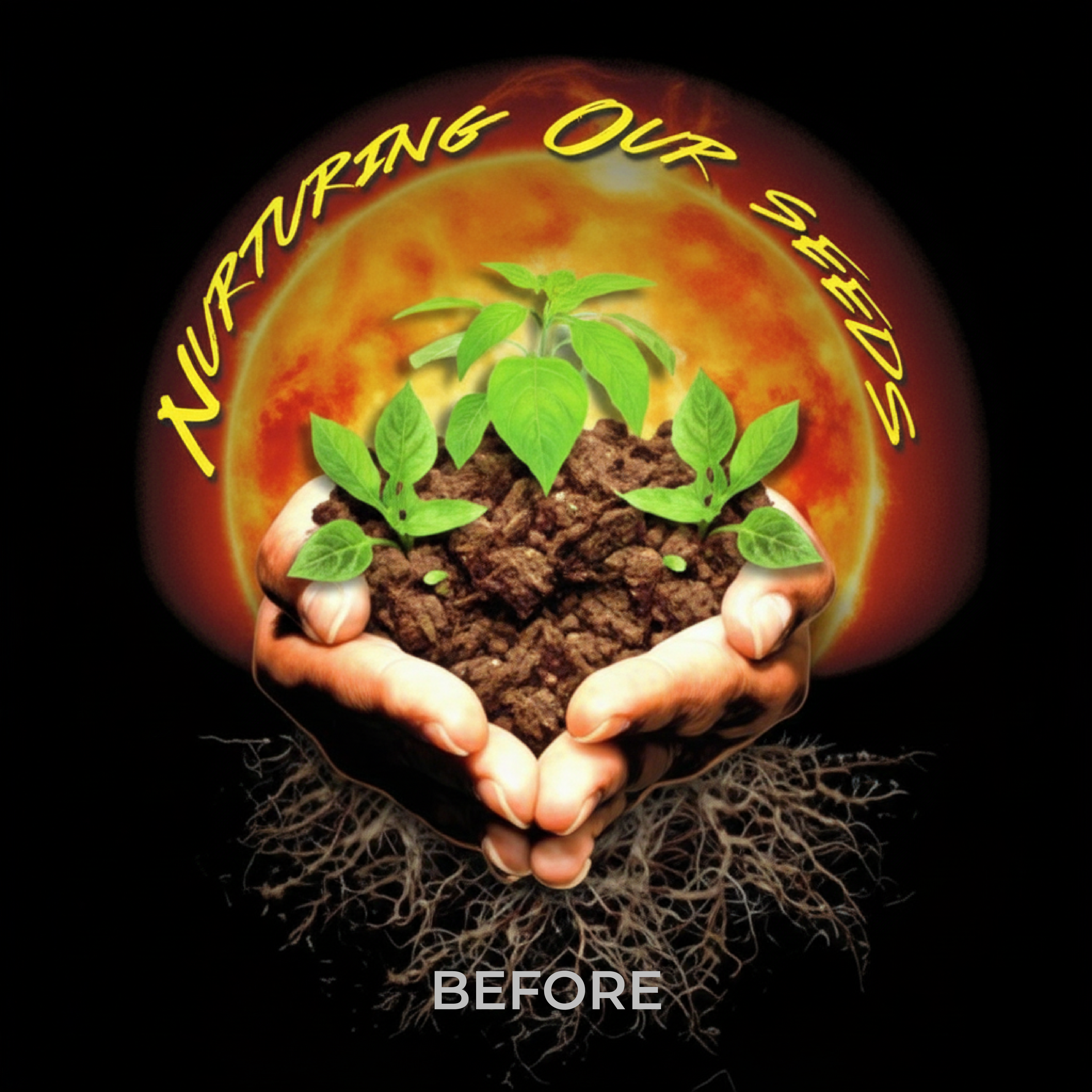
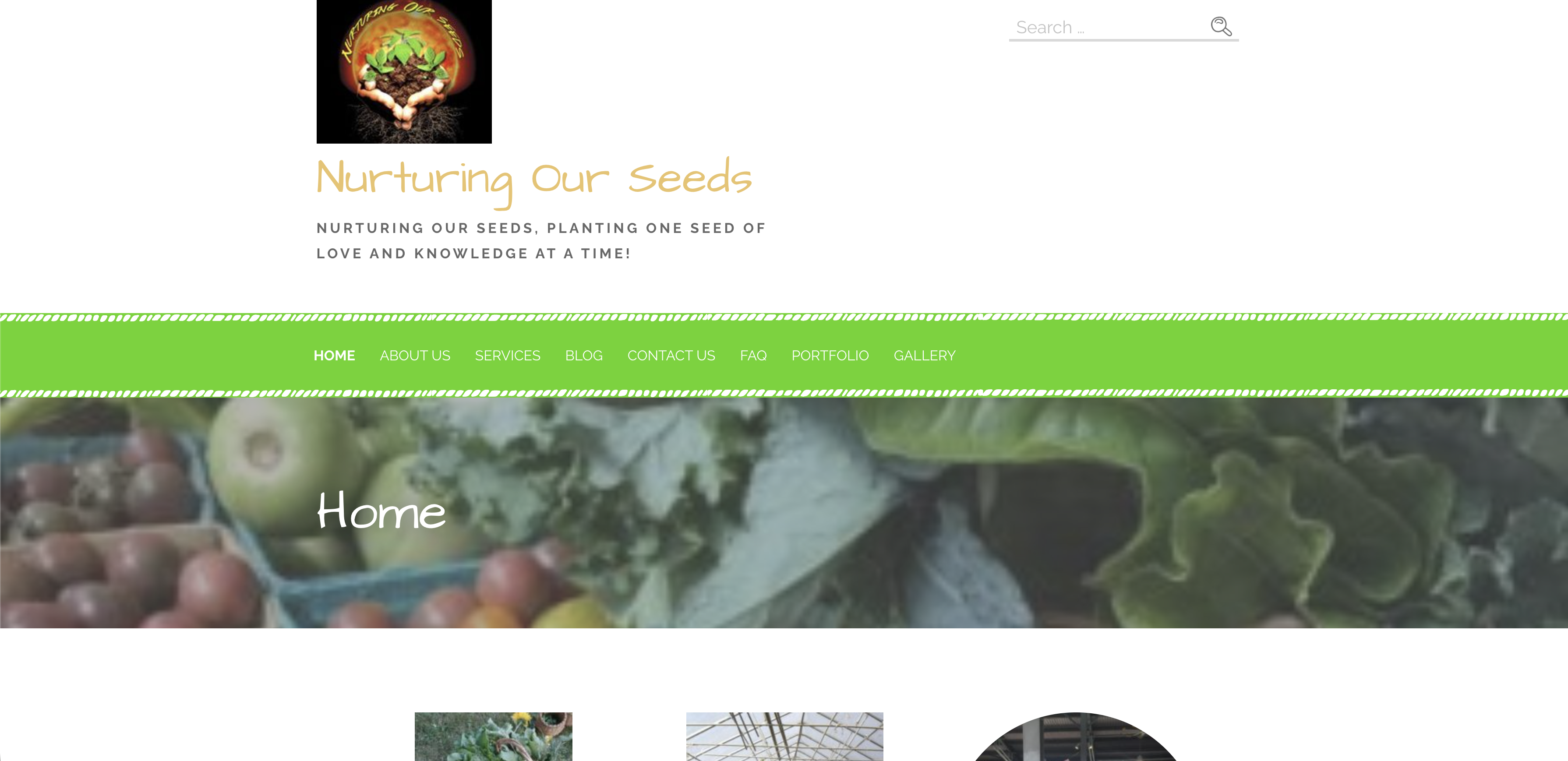
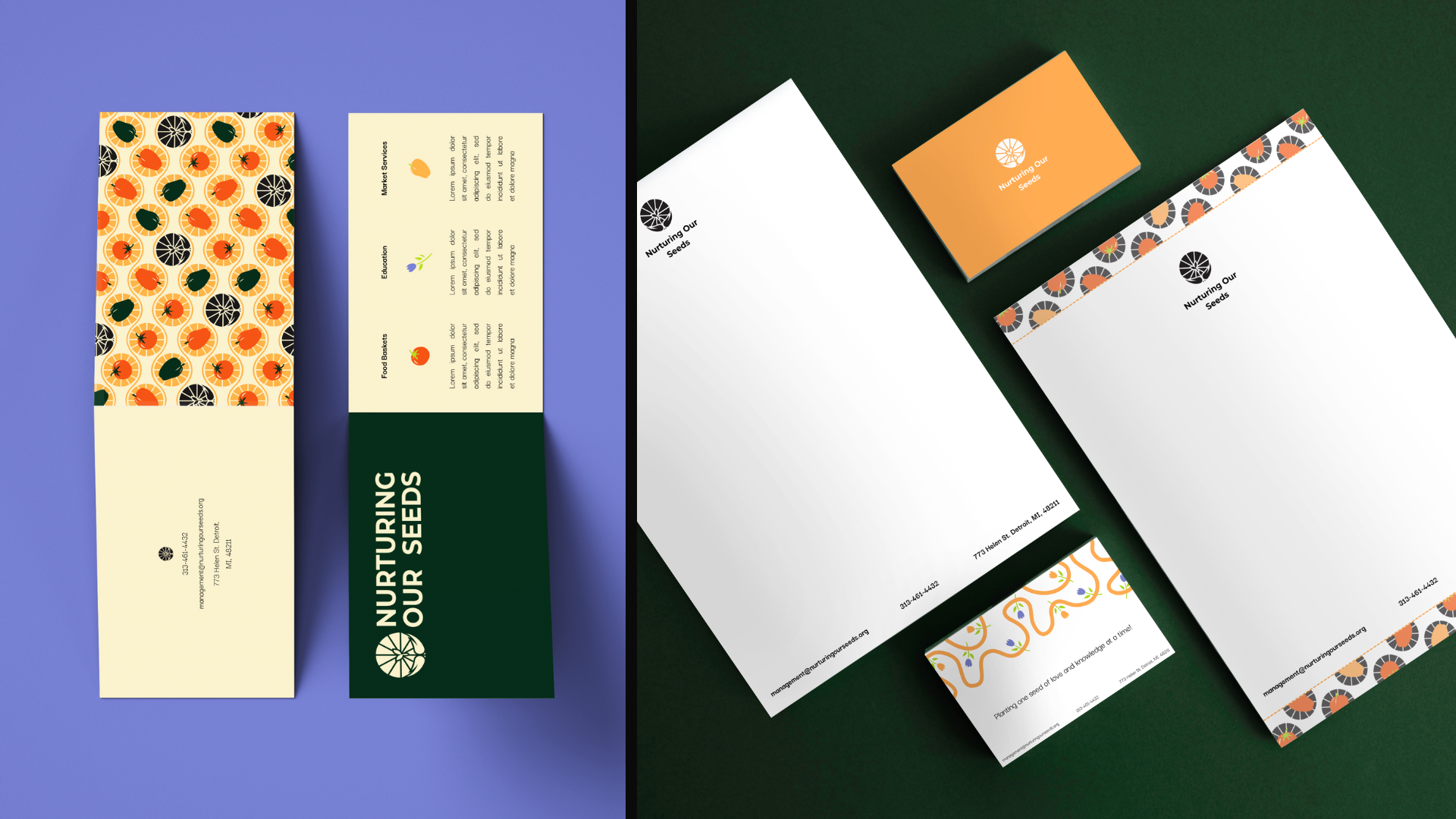
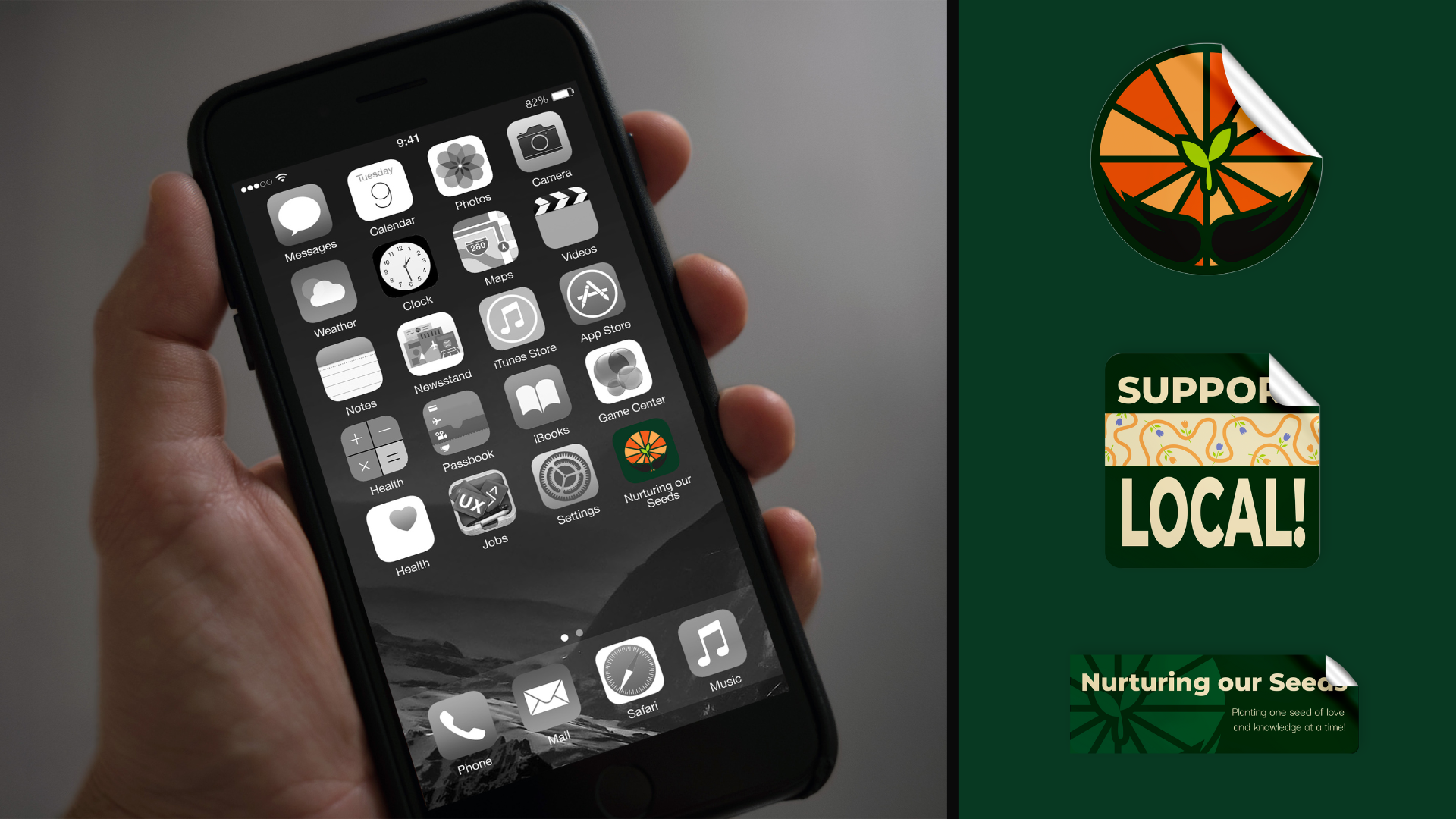
When we visited the farm, it was clear their work was powerful, but their brand didn't reflect that. A generic logo, an incomplete website, and no cohesive identity made it hard for them to communicate the warmth and impact of what they do.

We were brought in to change that.

My Contribution

I led the brand identity redesign and website overhaul for Nurturing Our Seeds, working directly with the founder from concept to completion. This included logo development, creating a complete visual system, and designing all website pages and brand applications alongside my team.

THE CHALLENGE:

What needed to change.


Outdated identity — The existing logo felt generic and disconnected from the community work happening on the ground.

Weak online presence — A basic WordPress theme with "Under Construction" notices undermined credibility.

No visual system — Without a color palette, typography, or iconography, the brand had no recognition.

Missing the soul — The brand didn't reflect Detroit's culture, the hands-on work, or the people it served.

DISCOVERY

We started by showing up.

The best way to understand what a brand needs? See it in action. We spent time at the farm, met the founder, toured the growing spaces, and talked to community members. That experience shaped everything that came next.

We learned the brand needed to feel warm, accessible, hopeful, and rooted in Detroit's artistic culture. It needed to work across print, digital, and physical spaces: from business cards to produce boxes.

LOGO DEVELOPMENT

A symbol that tells the whole story.

We started by sketching ideas that could represent care, growth, and community. After exploring dozens of concepts, we kept coming back to three core elements:

Hands — representing the physical care and community support that makes the farm work
Sun rays — symbolizing hope, warmth, and the growing process
Seedling — the farm's mission and the potential for change

The final mark combines all three into one cohesive symbol.

BUILDING THE IDENTITY

More than just a logo.

A logo is only the beginning. We built a full visual system that could flex across everything Nurturing Our Seeds does—from seed packets to social posts.

Color Palette — Inspired by Detroit's urban landscape and fresh produce: Zucchini Green, Melon Orange, Lemon Chiffon, Spring Bud Green
Typography — Darker Grotesque and Monsterrat for a modern, approachable feel
Patterns — Repeating motifs using logo elements and hand-drawn produce illustrations
Icons — Simple, warm graphics for vegetables, flowers, and hands

BEFORE & AFTER

From generic to genuine.

The website transformation was just as important as the logo. The old site felt like a placeholder. The new one tells their story.

The Old Site:

Generic WordPress theme with no customization.

Outdated visuals and "Under Construction" messaging.

Poor information hierarchy.

No visual connection to the organization's mission.

The New Site:

Custom design reflecting the brand identity.

Clear, warm hero section with the tagline.

Engaging imagery of real farm activities.

Intuitive navigation and strong calls-to-action

Key Improvements:

Homepage:
Bold hero section with mission statement and vibrant CTAs.
Photo gallery showcasing community engagement.
Clear service offerings (Food Baskets, Education, Events).

About Page:
Mission-driven messaging with authentic farm photography.
"Meet the Team" section humanizing the organization.

Gallery:
Grid layout showcasing farm work, workshops, and harvests.

Contact/Footer:
Comprehensive contact info, social links, and site navigation.
Branded footer with patterns and consistent color use

APPLICATIONS

Bringing it to life.

We didn't stop at the website. The brand system was designed to work everywhere, including business cards, stationery, merch, packaging, stickers, social templates, and signage.

REFLECTIONS

The result.

A Brand That Reflects the Mission

The new identity gives Nurturing Our Seeds a professional, cohesive presence that matches the quality and care of their community work. The warm, inviting design makes the organization more approachable while the modern aesthetic builds trust and credibility.

Takeaways.

This project reinforced the importance of community-centered design. Visiting the farm, meeting the people involved, and understanding the day-to-day impact of the work helped us create a brand that truly represented their values—not just what looked good on a screen.

Working through the full lifecycle—from initial sketches to final brand guidelines and website design—taught me how interconnected brand and UX work truly is. The logo informed the website's visual language, which informed the user journey, which reinforced the brand message.

Next steps.

While the organization hasn't yet implemented the new website, the brand identity has been delivered and is ready for rollout. Future phases could include developing the site in code, creating additional marketing materials, and expanding the design system as the organization grows.

Back to Top