Pilot Fish

See Prototype
ROLE
UI/UX Designer
TEAM
Cross-functional team (design, frontend, backend)
TOOLS
Figma, Trello Board
DURATION
2 months, May - July 2025

OVERVIEW

Brief


PilotFish is a private, student-focused mobile app that connects people through shared wellness goals and interests.

PilotFish helps build healthier, more socially connected communities starting with the college campus. Designed with privacy and emotional safety in mind, the app allows students to create a profile, share their wellness interests, and discover others nearby who enjoy the same healthy activities, from running and yoga to mindfulness and walking groups. PilotFish encourages low-pressure, meaningful connections in an increasingly self-reliant world, reminding us that while personal growth is important, we are better together.

My Contribution

I led the visual redesign of the PilotFish mobile app, working closely with engineering teams to ensure the updated UI was modern, cohesive, and technically implementable. My role focused on refreshing the app’s visual identity for a student audience—introducing a calming color system, simplifying the layout, and ensuring design consistency—while preserving the original user flow. I produced high-fidelity mockups and supported development with clear documentation and design assets.

Why was the

Redesign Needed?

College students often struggle to find trustworthy, organized, and student-centered platforms for subleasing. Existing tools are fragmented and don’t reflect the unique rhythms and concerns of student life, such as academic calendars, trust between peers, and housing logistics.
The redesign aimed to bring modernity, warmth, and polish to the interface—making it more appealing and easier to use for its student audience.
  • Outdated Design: The visuals didn’t reflect the needs or expectations of today’s university students.
  • Inconsistent UI Patterns: A lack of visual hierarchy and standardized components led to a disjointed user experience.
  • Brand Misalignment: Students and stakeholders felt the design didn’t match the platform’s focus on trust, health, and personal connection.
  • Implementation Gaps: Without a cohesive design system, development was slowed by guesswork and inconsistency.

THE REDESIGN

Before & After

This section offers a side-by-side comparison of the original and redesigned screens. Each comparison highlights specific visual and structural improvements including updates to layout, color, typography, and component consistency. All of the steps that helped modernize the interface while preserving the existing user flow.

Welcome Screen

The welcome screen remained largely unchanged in structure, but received updated styling and colors to better reflect the modern UI. Margins were adjusted to prevent the text from reaching the edges, improving visual balance and readability.

Sign Up Screen

This screen was visually refreshed with softer, less boxy input fields and improved spacing. While the layout stayed the same, the new color scheme and type hierarchy gave the screen a friendlier, more approachable feel.

Login Screen

Along with general visual updates, I added new login options for Google, Facebook, and Apple to streamline access. A “Remember Me” checkbox and subtle input icons were also introduced to enhance clarity and usability.

Program Matches

This screen underwent a full redesign. I replaced original tiles with a card-based layout for better image presentation and added a top search bar with filter and menu icons. The navigation was relocated to a fixed bottom bar with clearer labels and icons for Programs, People, Messages, Profile, and Settings. Quick filters were retained and the program cards now include icons for direct interaction. Finally, floating action button allows users to create their own program.

People Matches

Previously nested under the Program Matches section, People Matches now exists as a dedicated screen. Layout updates included smaller profile images beside the user's name and class year, more space for activity icons, and a redesigned match percentage indicator using a linear format. A top search bar, filters, and menu icon were added for consistency with the Programs screen.

Search Function

The search bar, as mentioned previously, received a full visual style update. Additionally, program results now display in a compact list format with smaller preview images, titles, and descriptions, making it easier to scan and compare options at a glance.

User Profile

This screen was visually cleaned up to highlight key user information. The gradient header and redundant name display were removed, and the user’s name was moved just beneath the profile image. Editing is now handled through a single, centralized button rather than multiple section-based controls.

Profile Viewing

The structure mirrors the updated User Profile layout but is optimized for viewing other users. The edit button is replaced by a message button which navigates to the Messages Screen. Tapping on a person from the Matches screen reveals a full-size profile image at the top of this page. A simplified, modern block button was added in the top-right corner for safety controls.

Messaging

While the layout for this section stayed largely the same, I applied the usual visual updates for consistency. Also, a new prompt encourages users to enable notifications if disabled, and a plus button in the bottom corner lets users easily start new conversations.

At the start of the project, I reviewed the original screens to identify key visual and usability issues. This section outlines my initial concerns along with suggested updates to improve clarity, cohesion, and overall user experience.

PROCESS

Primary Concerns

  • Welcome Page:
    a. Lack of images for identification
    b. Unclear icons
    c. No Filters
  • Login/Sign Up
    a. Images look like buttons
    b. Buttons too low
    c. Cleanup needed
  • People Page
    a. Clean up (style does not match)
    b. Add compare schedule feature
  • Main Page/Matches
    a. Images do not crop (not fitting)
    b. Update Icons
    c. Color scheme not cohesive
    d. Sort-by feature does not work
    e. Add filters instead of group buttons
    f. Creating a group is challenging
    g. Component blocks look dated
  • Search
    a. Results do no show up
  • Profile Page
    a. Clean up needed (smaller photos, typography illegible)

Ideation Sketches

Before starting on the wireframes or mockups, I first sketched out early layout ideas to explore how to make the interface feel more intuitive, cohesive, and better aligned with student needs. These early sketches not only helped clarify spacing, grouping, and element position, it also allowed me to get some initial feedback on some of the suggested changes

Digital Wireframes

The next step was to create some low-fidelity wireframes which allowed me to test revised layouts without the distraction of color or typography. I reviewed these wireframes with internal teams to ensure no major changes would interfere with the existing app structure, which remained stable throughout the redesign. The main change that came from the review was removing the "create program" button fro the center of the menu as it was not the focus.

Style Guide

Before moving into high-fidelity screen design, I created a compact style guide to ensure visual consistency and streamline handoff. The guide included foundational UI elements such as the color palette, buttons, components, icons, and text hierarchy. This helped establish a clear visual language early on, allowing the final designs to feel cohesive, accessible, and ready for implementation.

FINAL PRODUCT

Hi-Fidelity Screens

These are the final high-fidelity mockups developed from the updated style guide. Displayed together, they showcase a cohesive, modern design system applied consistently across the app’s core screens, tailored to the needs of student users and ready for development handoff.

Next Steps

Moving forward, the clear next step would be to expand usability testing with real university students to gather feedback on the visual redesign and interaction updates. While the new design system improved cohesion and clarity, insights from actual users will help validate assumptions and guide potential microinteractions or feature refinements. This would require the front-end and back-end coders within the team to implement my designs into the actual app, ensuring the transition from mockups to a fully functional product is smooth and faithful to the intended user experience. Another step would be to document edge cases and responsive states to ensure the design performs well across different screen sizes and accessibility needs.

Takeaways

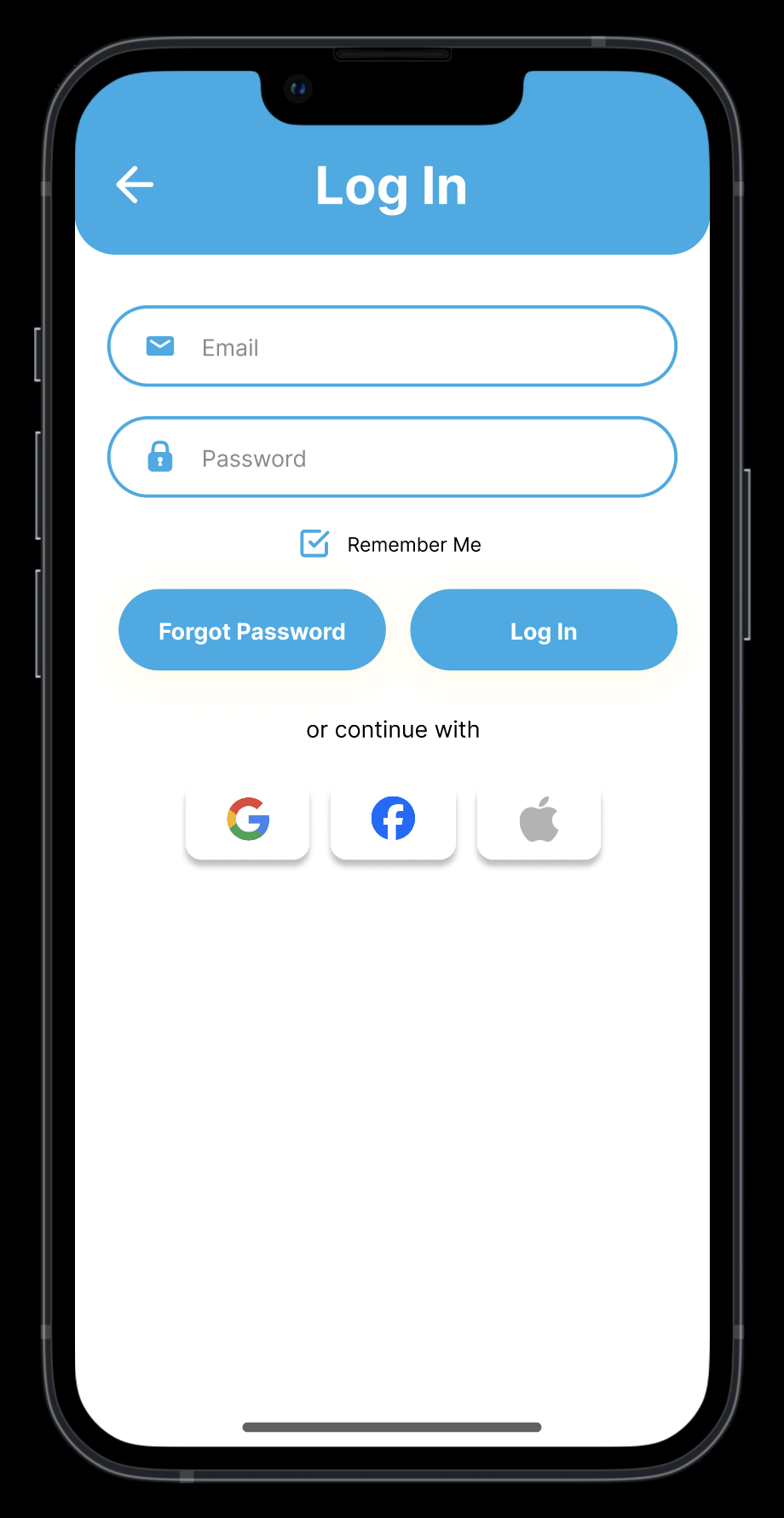
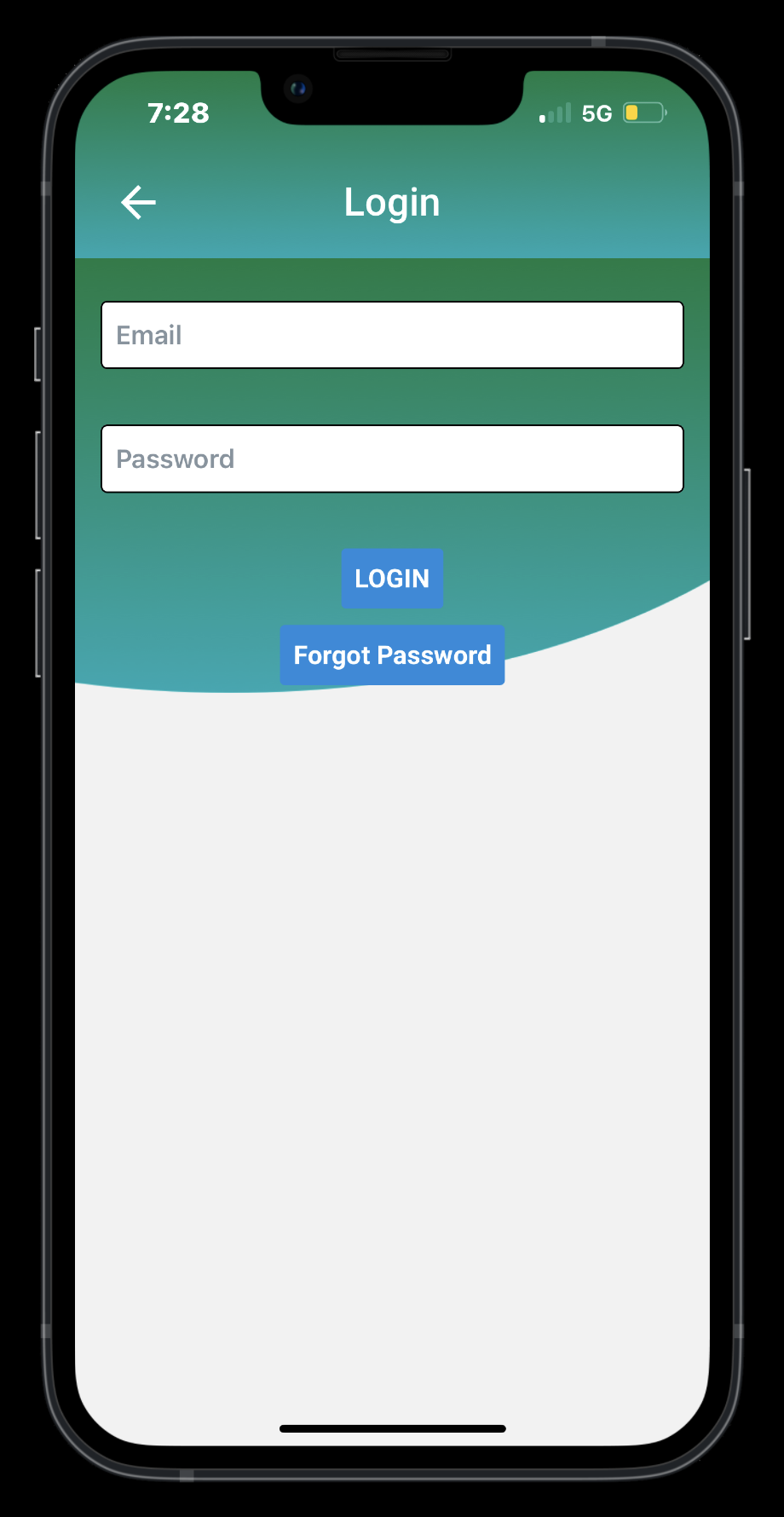
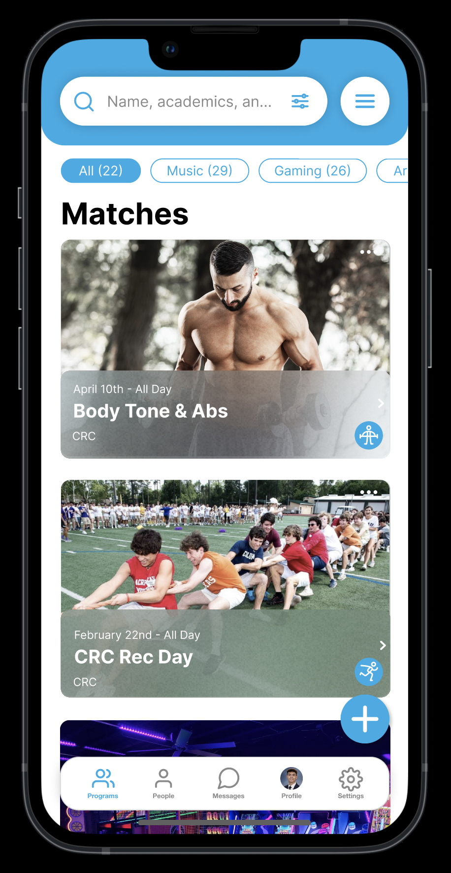
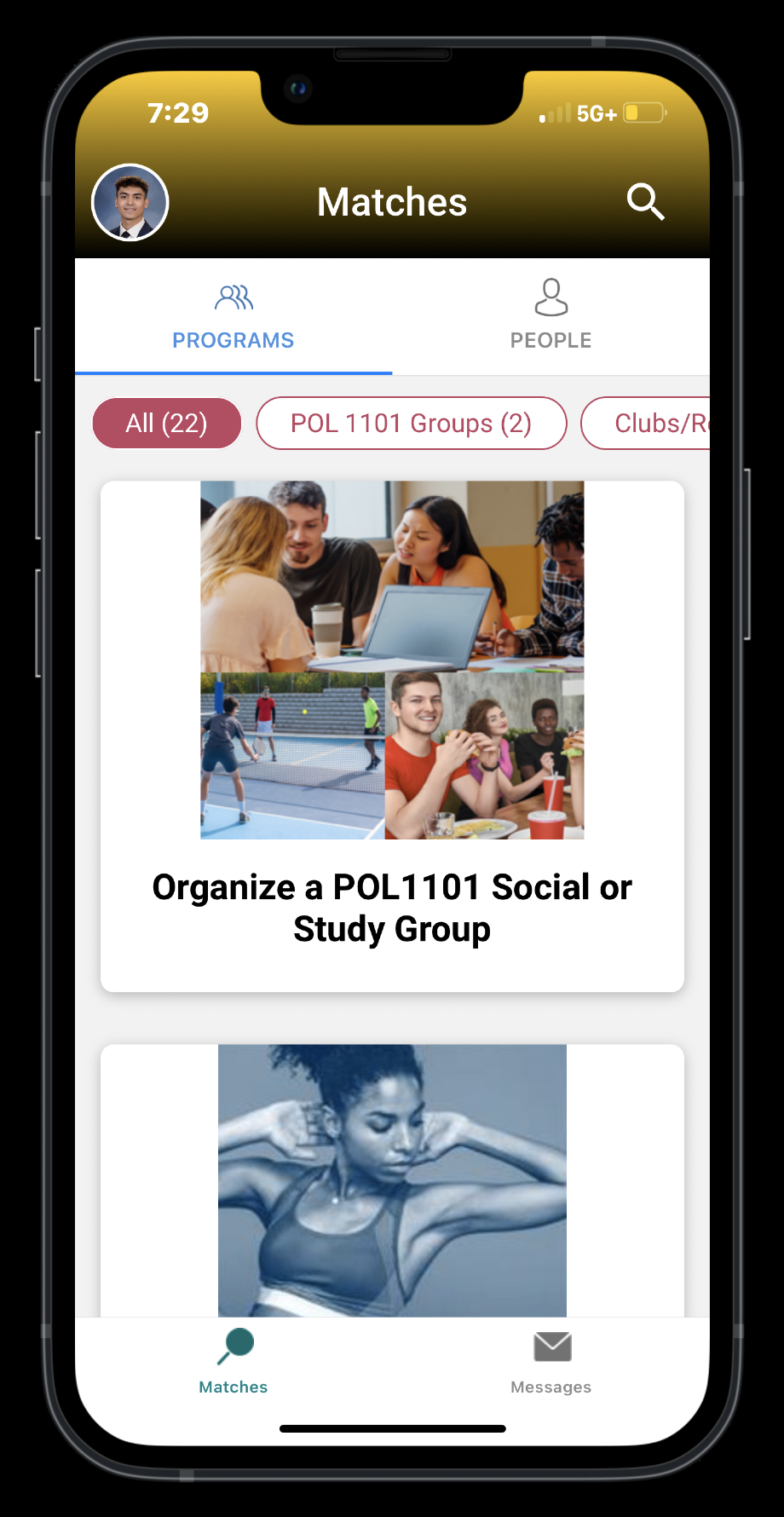
This project was a valuable exercise in visual problem-solving without altering core UX flows. Working within the existing constraints of the app, I learned how much impact a cohesive style guide and subtle layout improvements can have on usability and perception. It also reinforced the importance of clear communication across design and engineering to make sure that style changes I made could be cleanly translated into code without disrupting functionality. Designing for students also reminded me to prioritize simplicity, clean visuals, intuitive navigation, and a smoother, faster experience that feels familiar and easy to use.

Back to Top