ROLE
Graphic Designer
TEAM
Solo class project (STAMPS Sophomore Review)
TOOLS
Adobe Illustrator, Photoshop, Pencil & Paper
DURATION
6 weeks, July - Aug 2024

OVERVIEW
Created as part of my Sophomore Review at STAMPS School of Art & Design, this self-directed project explores the role of graphic design in moments of crisis and solidarity. I developed a political poster series for the “Stop Asian Hate” movement, using design as a tool for education, empowerment, and activism. The campaign seeks not only to raise awareness but to create a sense of community for AAPI individuals and direct viewers toward tangible resources for change. Drawing inspiration from historical and contemporary struggles against racism, each composition was crafted to speak boldly and empathetically across language, culture, and experience.
This project was an independent effort from the research, concept development, and illustration, to typography, layout, and production. I blended historical context and present-day activism into visual language, guided by my own perspective as an Asian American. I also ensured that each piece could function both individually and as part of a series of action and advocacy.
RESEARCH
Historical & Cultural Insights:
Legislation & Public Response:
Design Goals:
FINAL PRODUCT
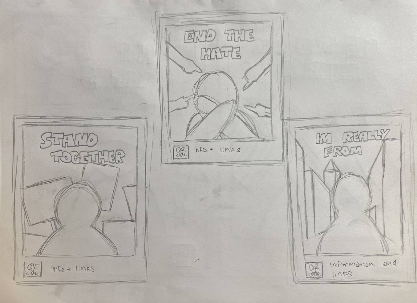
Below are five unique compositions I created to depict the lived experiences and struggles of the Asian American Pacific Islander (AAPI) community in the aftermath of the COVID-19 pandemic. Each poster approaches the theme from a different angle from highlighting discrimination, to identity, solidarity, and resilience. I wanted these pieces to not only raise awareness but also offer a sense of community and encourage people to learn more or take action.
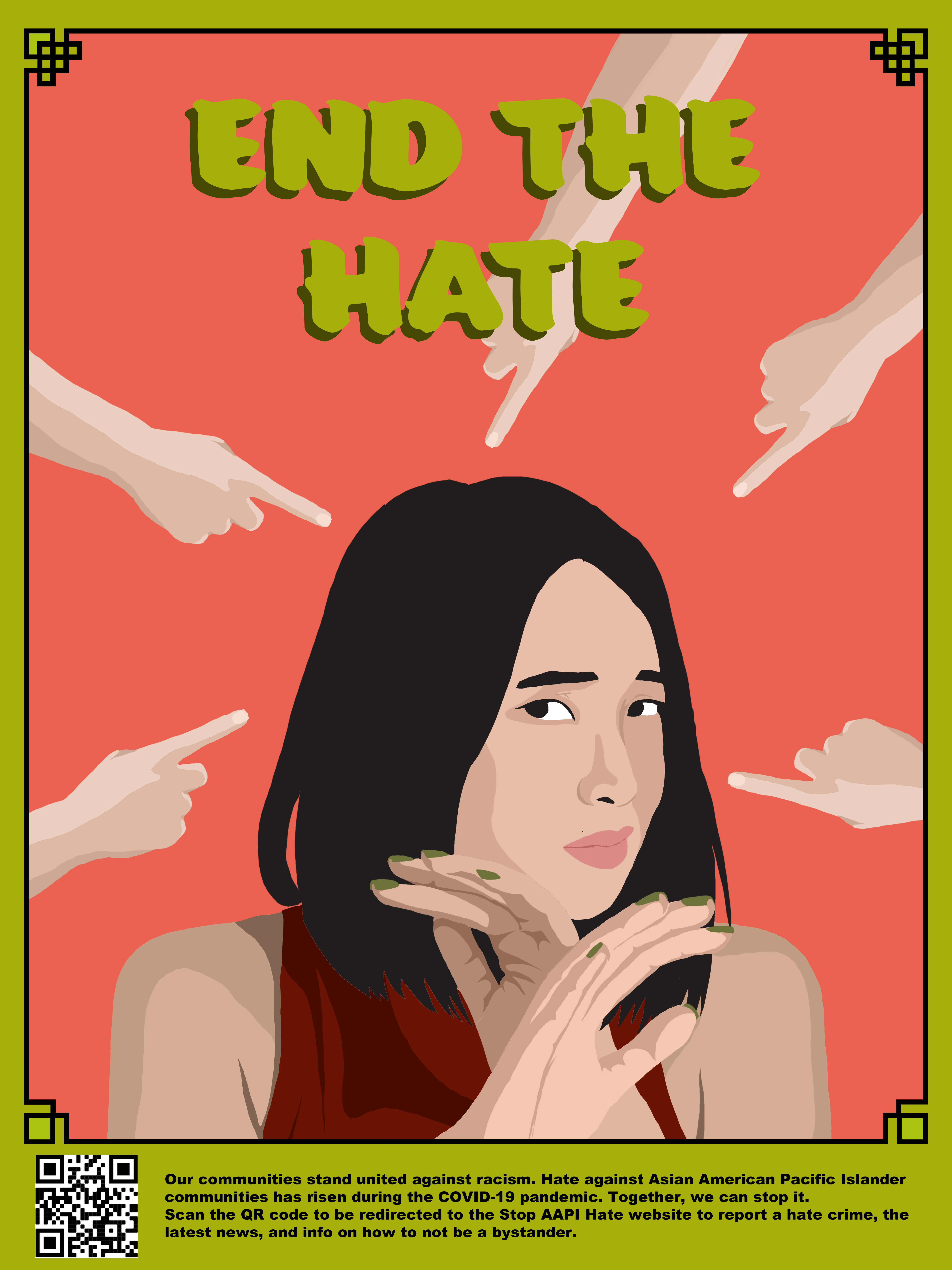
This composition uses accusatory pointing hands and a fearful central figure to convey the impact of scapegoating. The red background intensifies the emotion, while the green title, “End the Hate,” disrupts the warm tones with an eye-catching contrast. The subject’s gesture of self-protection evokes empathy and defensiveness, prompting viewers to consider how such actions create real harm. The overall simplicity and immediacy of the imagery make the message powerfully clear.
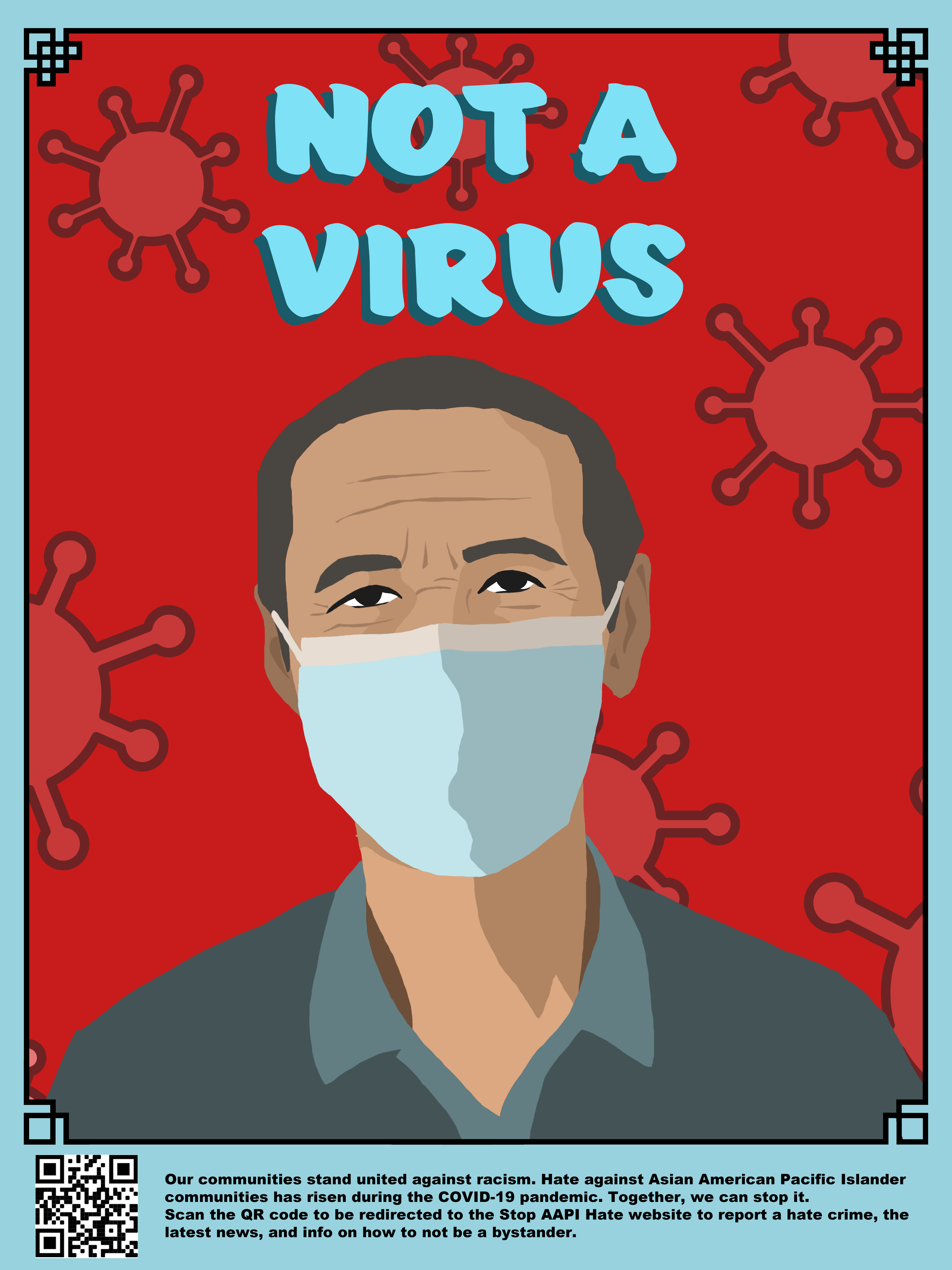
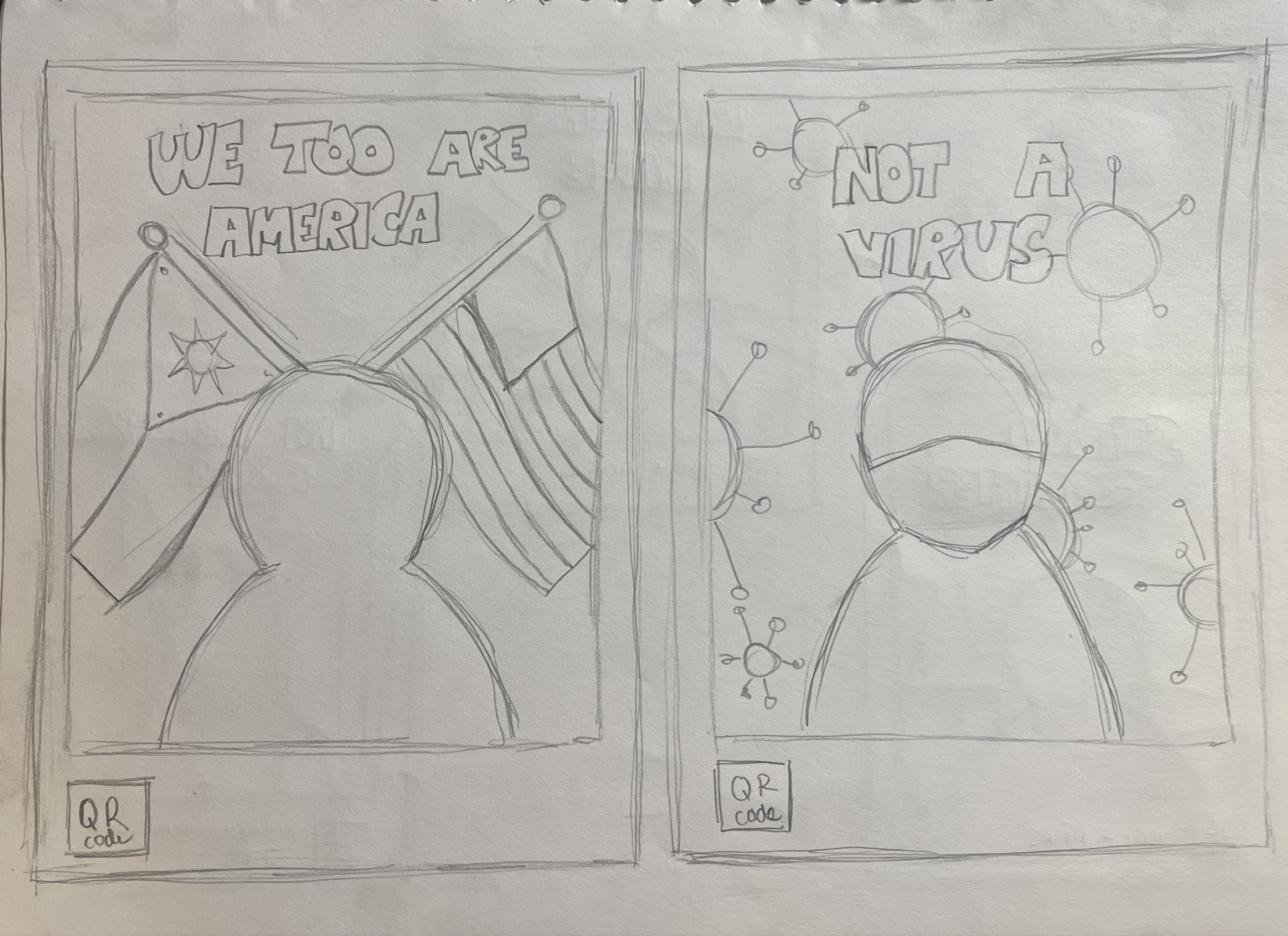
This poster confronts the dehumanizing rhetoric that Asian communities faced during the COVID-19 pandemic. A masked figure stares directly at the viewer against a red background filled with virus icons, driving home the message that people are not to blame for a public health crisis. The bright blue title, “Not a Virus,” stands out with urgency and compassion. The clean, direct framing ensures the focus stays on the subject’s humanity rather than the surrounding fear.
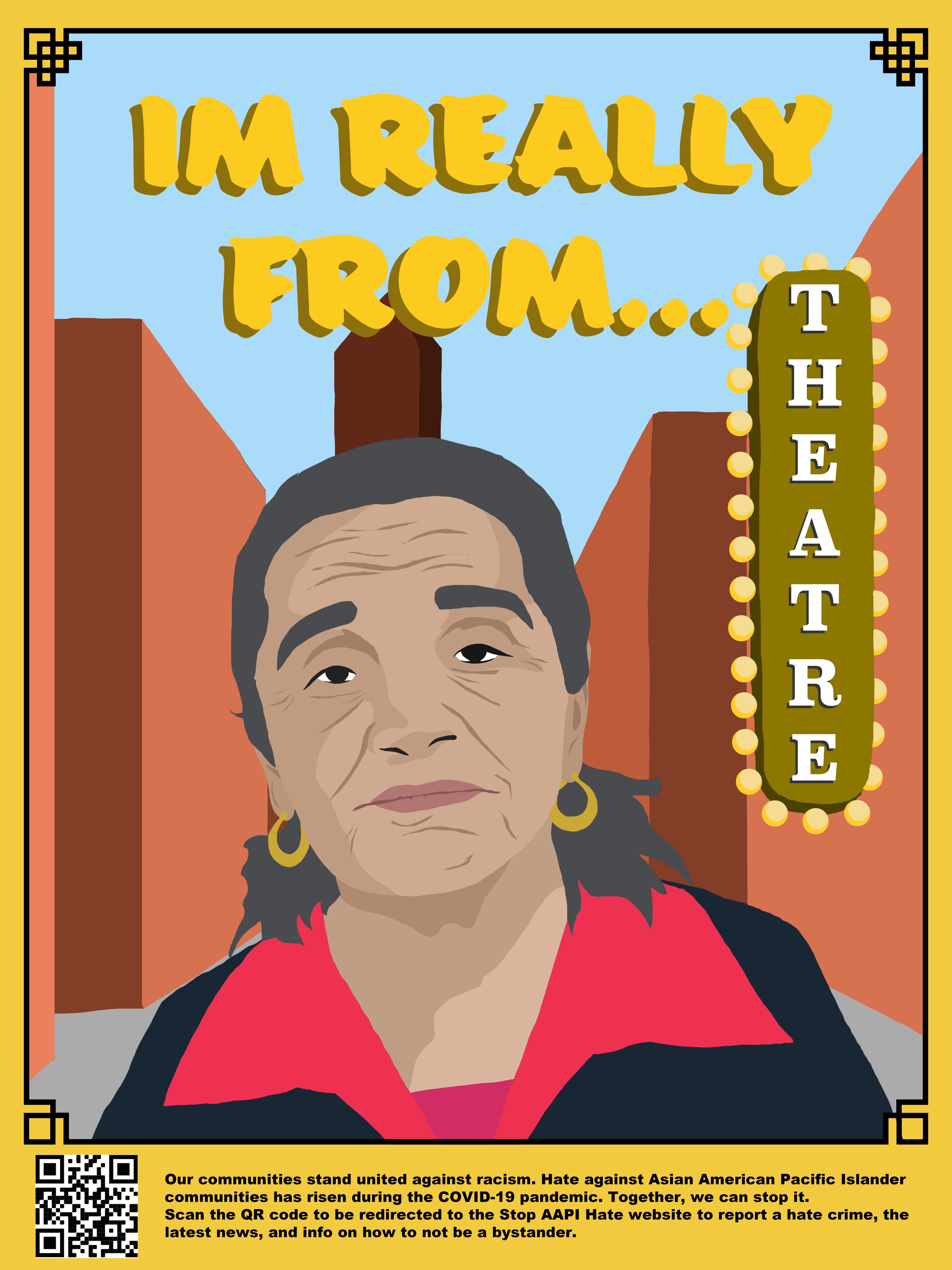
This piece shifts the conversation from ethnicity to individuality. It features a woman in front of a stylized theatre marquee that humorously and assertively answers the implicit “Where are you really from?” question. The warm background tones and vertical text placement suggest pride and personal narrative, pushing back against reductive stereotypes. This piece emphasizes that identity is complex and rooted in passions, not perceptions.
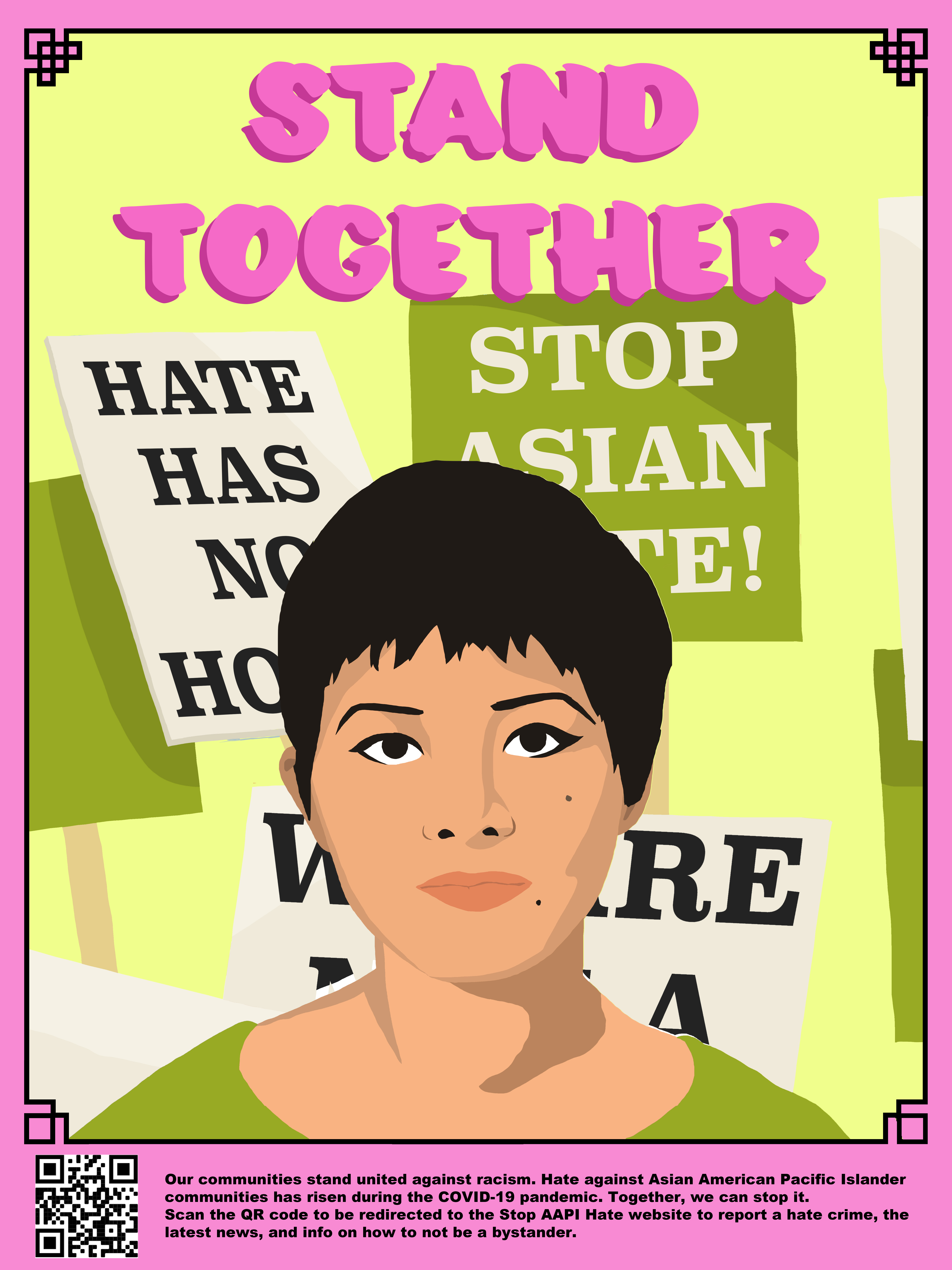
This poster evokes solidarity and protest, with a calm but resolute figure in front of rally signs calling for an end to anti-Asian hate. The pastel yellow background contrasts with the strong black text, and the bold pink title adds a surprising touch of softness to an otherwise firm message. The layering of protest signs reinforces the collective nature of this struggle, making the viewer feel part of a broader movement.
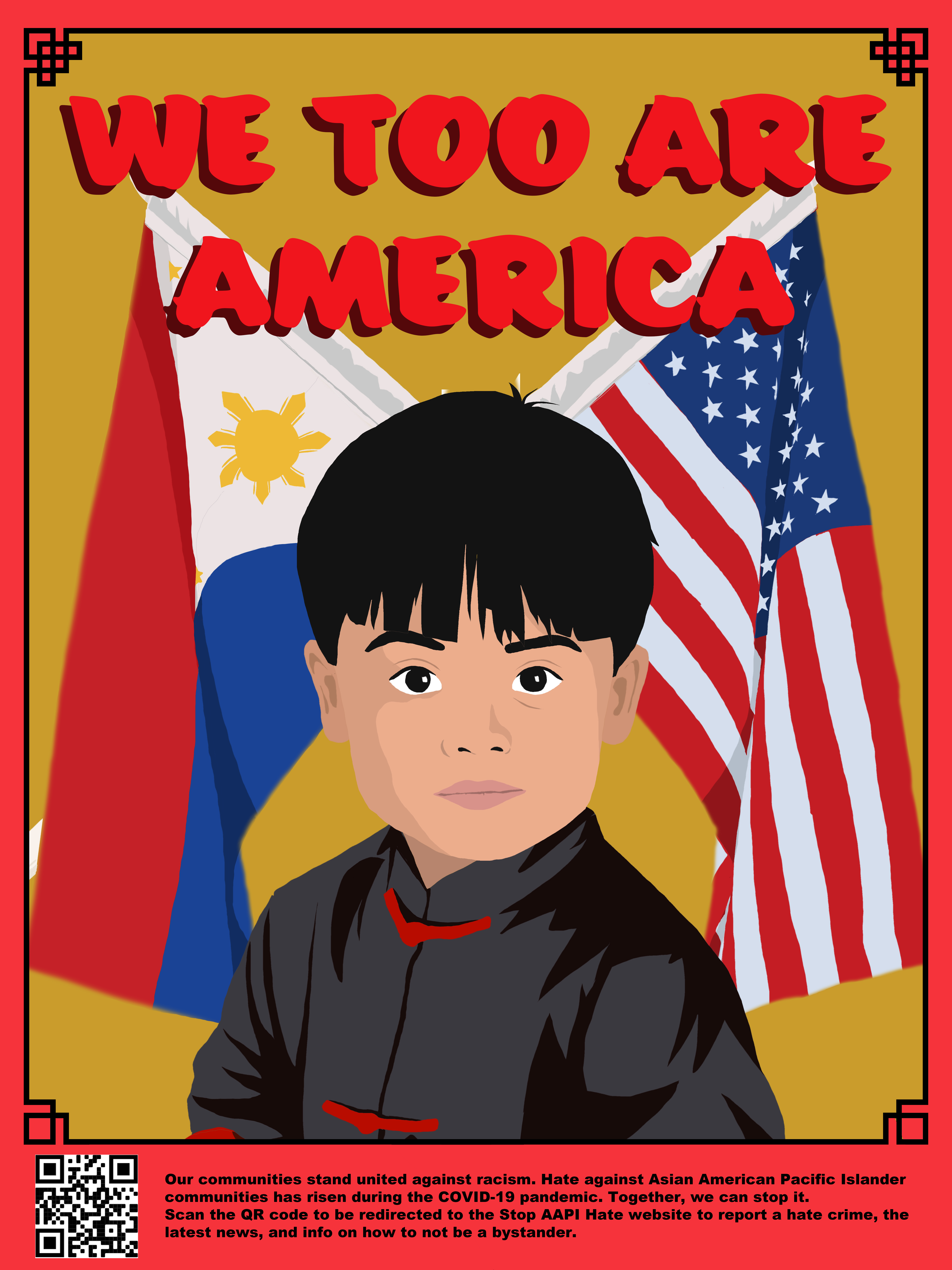
The final piece features myself as a young child in traditional attire framed by both the American and Filipino flags. The message “We Too Are America” boldly claims national belonging. The imagery suggests that cultural heritage and patriotism coexist, especially in the lives of immigrant families and children of diaspora. The figure’s direct gaze asks viewers to reconsider who they imagine when they think of “Americans.”
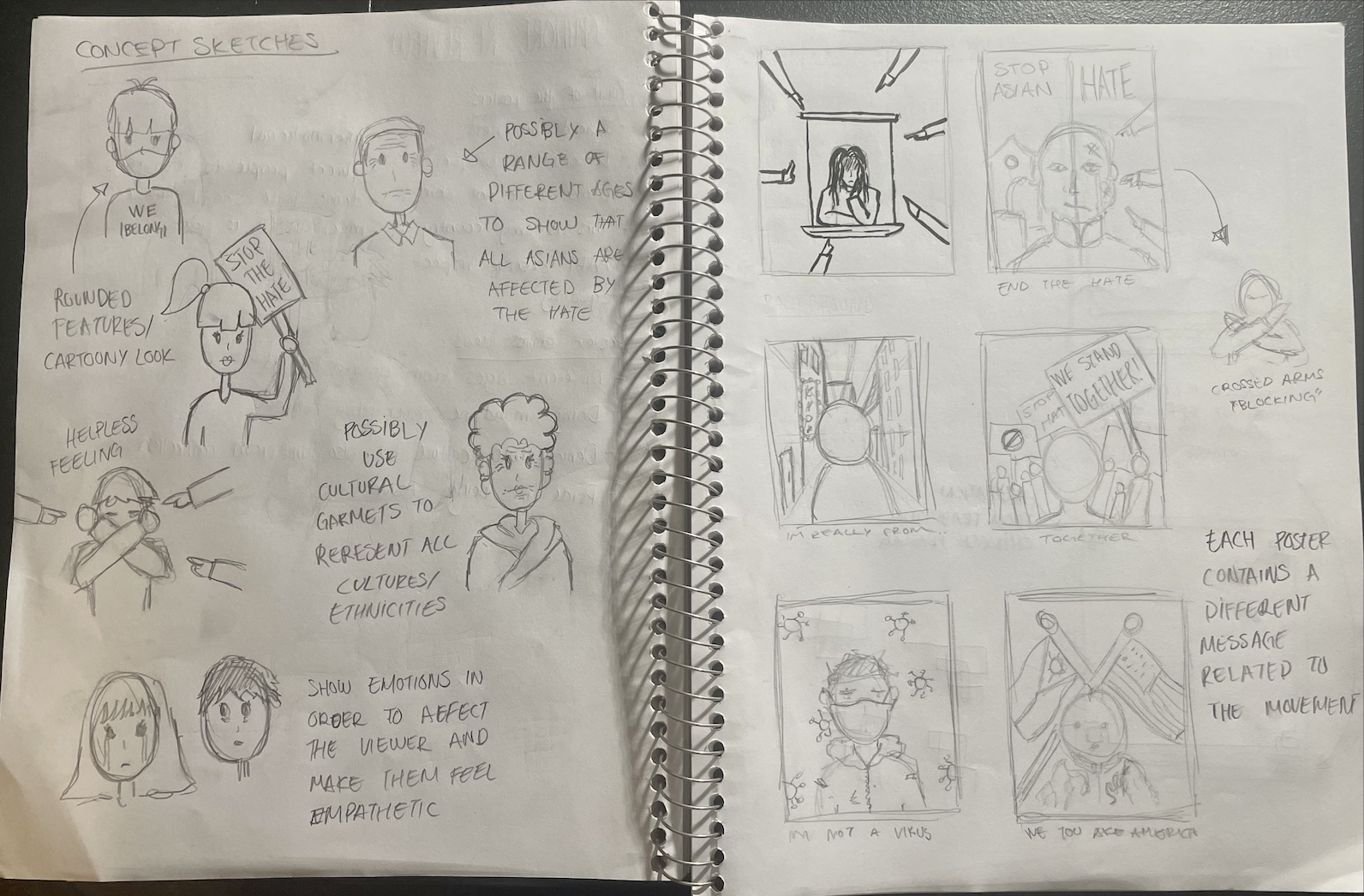
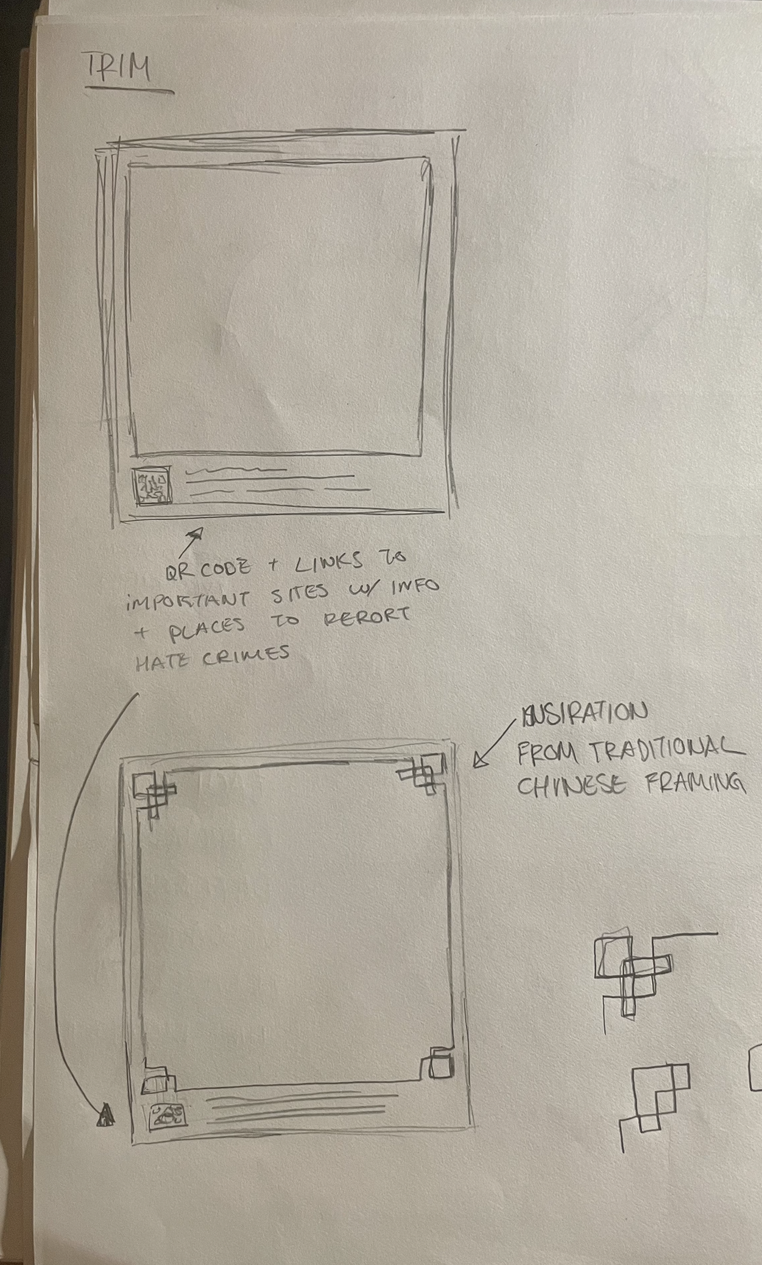
From there, I refined each concept digitally, choosing bold colors, strong typography, and simple but emotional imagery that could stand out and communicate quickly. I also thought a lot about how the posters would work as a group such as repeating elements like the corner motifs and QR codes helped tie everything together while still letting each piece have its own voice. The final designs went through several rounds of tweaks based on feedback and self-critique, making sure the message in each one came through clearly.


To build on this series, the next phase could involve community engagement initiatives that pair each poster with a short video or audio testimonial from individuals featured or represented. A traveling exhibition or outdoor installation in schools, public transit systems, or cultural centers could broaden impact. Additionally, an educational toolkit could accompany the visuals, helping teachers and facilitators lead discussions around racism, bystander intervention, and the historical context of AAPI discrimination. Collaboration with local artists, students, and activists would further root the work in community voice and participation.
This project demonstrates how visual storytelling can disrupt dominant narratives and humanize marginalized communities. A key takeaway was the power of specificity and how each poster becomes stronger when it moves beyond generic representation and offers a distinct voice or perspective. Designing for emotional resonance, not just clarity, helped the series connect with viewers more deeply. Another insight was the importance of cohesion and using repeated design elements like corner motifs, QR codes, and bold colors unified the series and amplified its collective message. Most importantly, this work affirms that art can be both a tool for resistance and a platform for empathy.